2 Data mapping
2.1 Starting QGIS
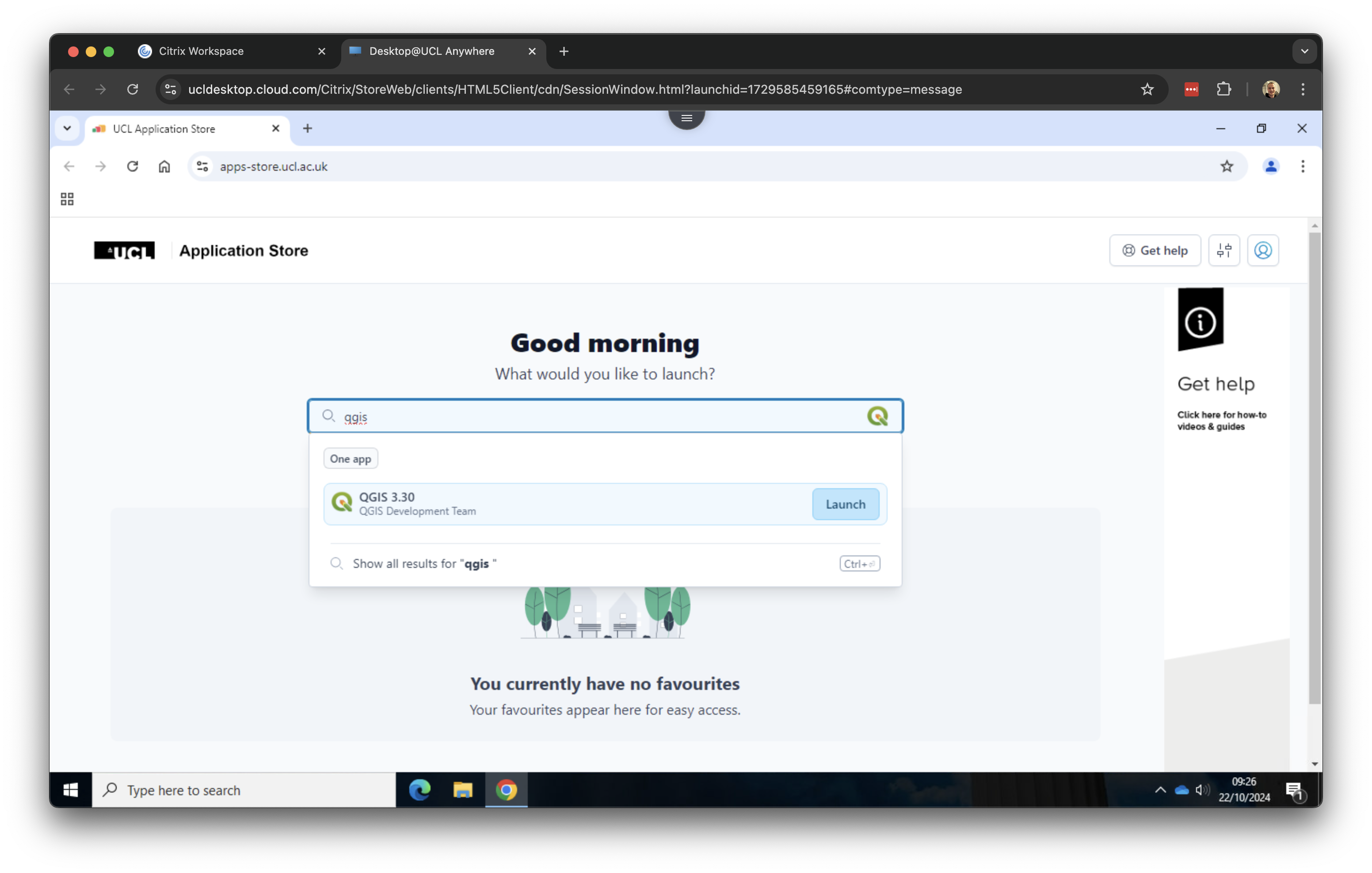
Now we have downloaded and organised our data, we can open QGIS. QGIS is a free and open-source cross-platform desktop geographic information system application that supports viewing, editing, and analysis of geospatial data. Open the UCL Application Store and type QGIS In the search box. Click on QGIS 3.30 to open the software.
QGIS might take a few moments to start, so please be patient. Occasionally, the UCL Application Store may not launch QGIS on the first try; if this happens, simply try again a few times until it starts successfully.
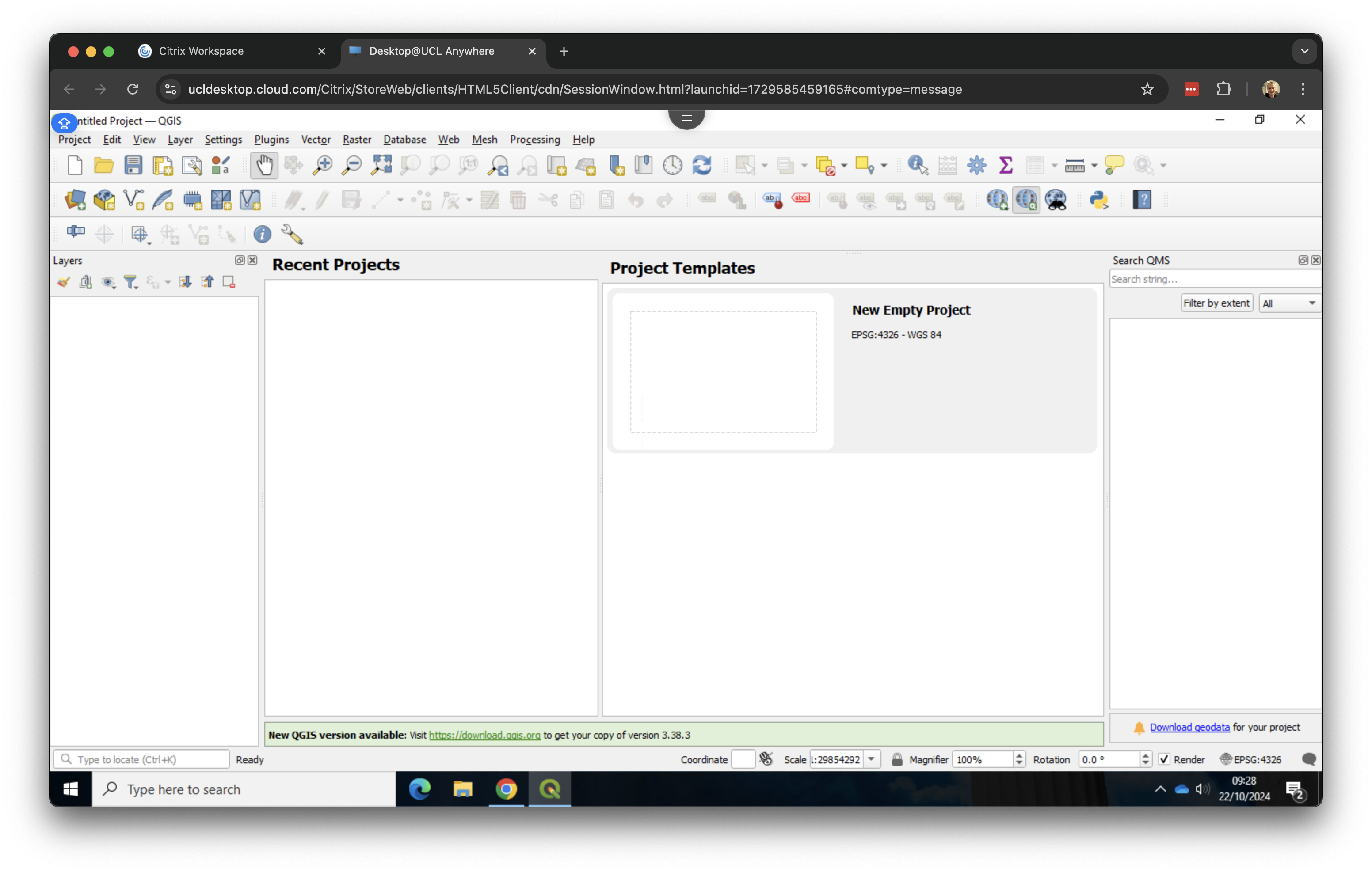
Once QGIS has started, you will see two panels on the left hand side: Layers and Browser. We do not really need the second one, so you can close it by clicking on the x. The QGIS interface should now look something like this:
2.2 Loading spatial data
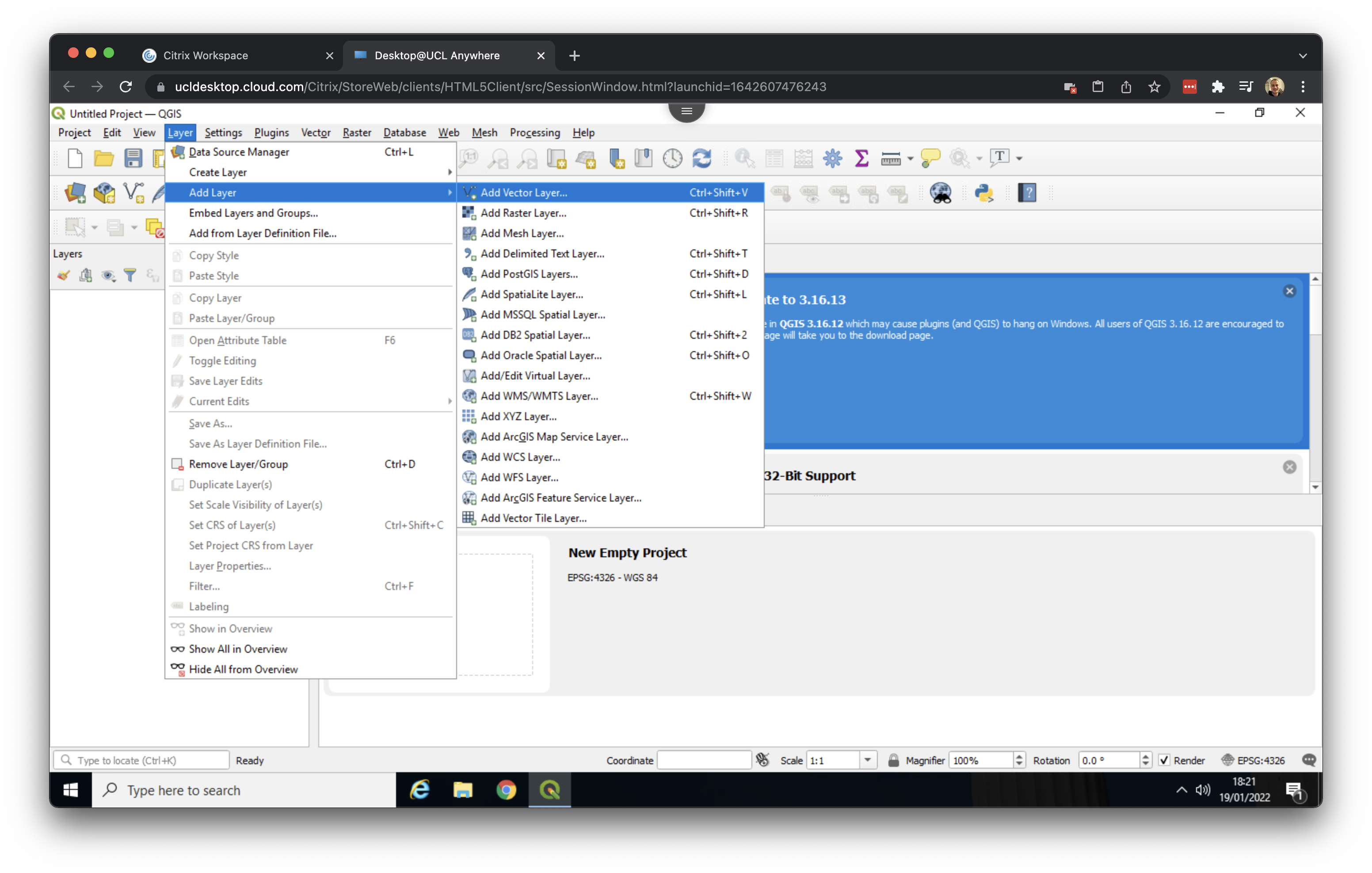
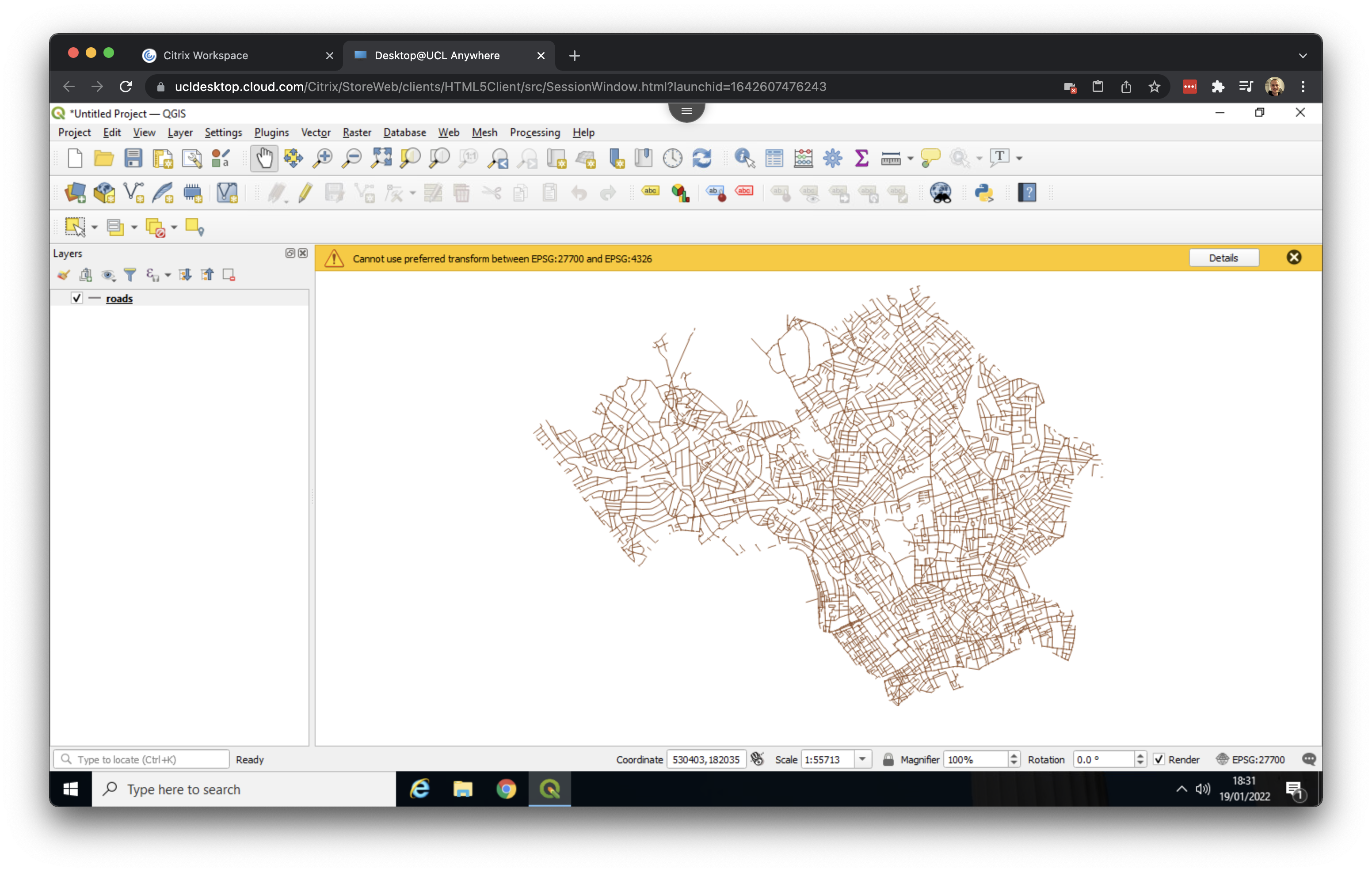
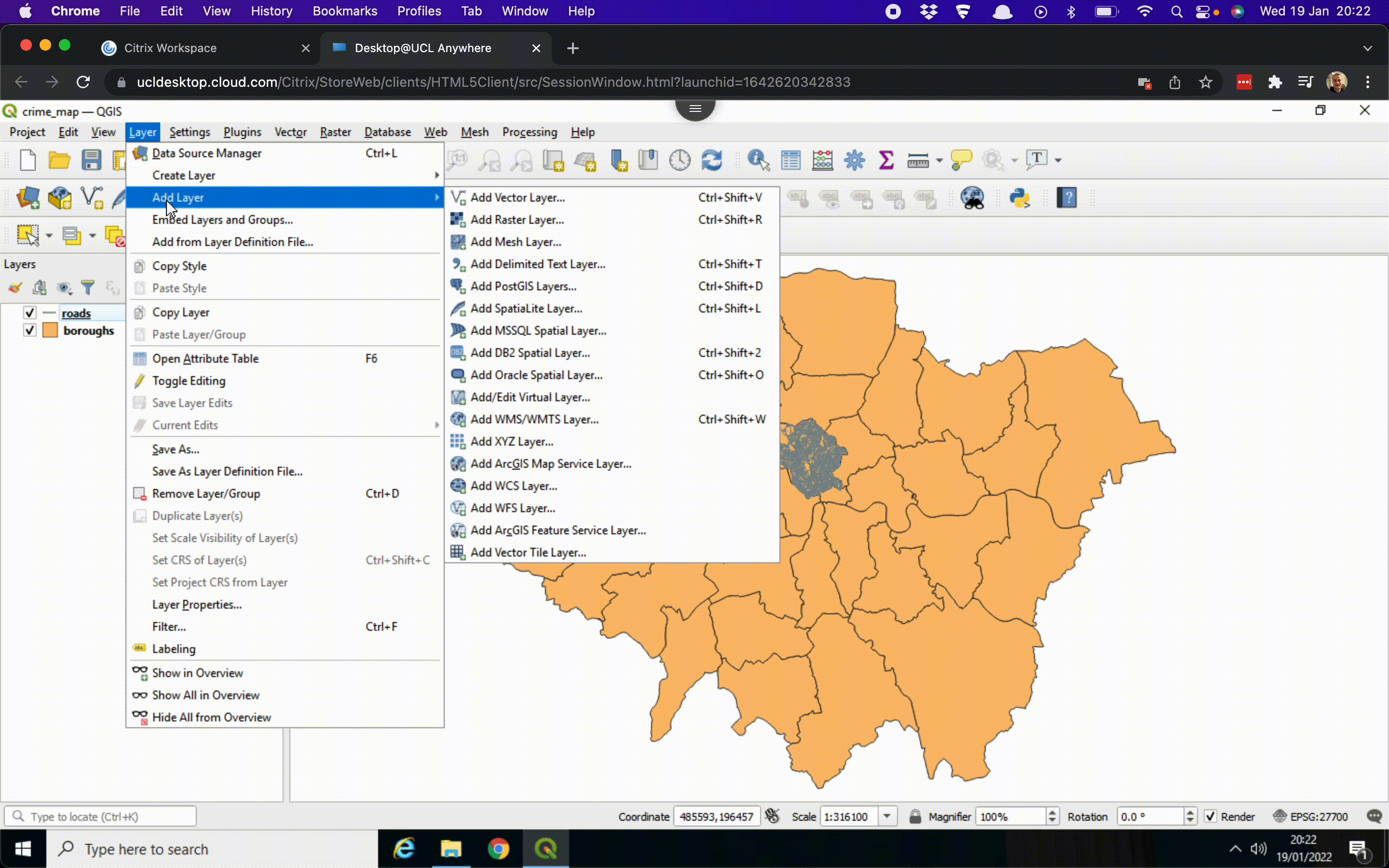
We can now start by adding our spatial data. We will start by adding our roads layer. Click on Layer > Add Layer > Add Vector Layer ….
Click on the three dots (…) next to the Vector Dataset(s) box and navigate to your working directory. Then go into your roads folder and click on the roads file with the SHP File type. This is the roads shapefile that we want.
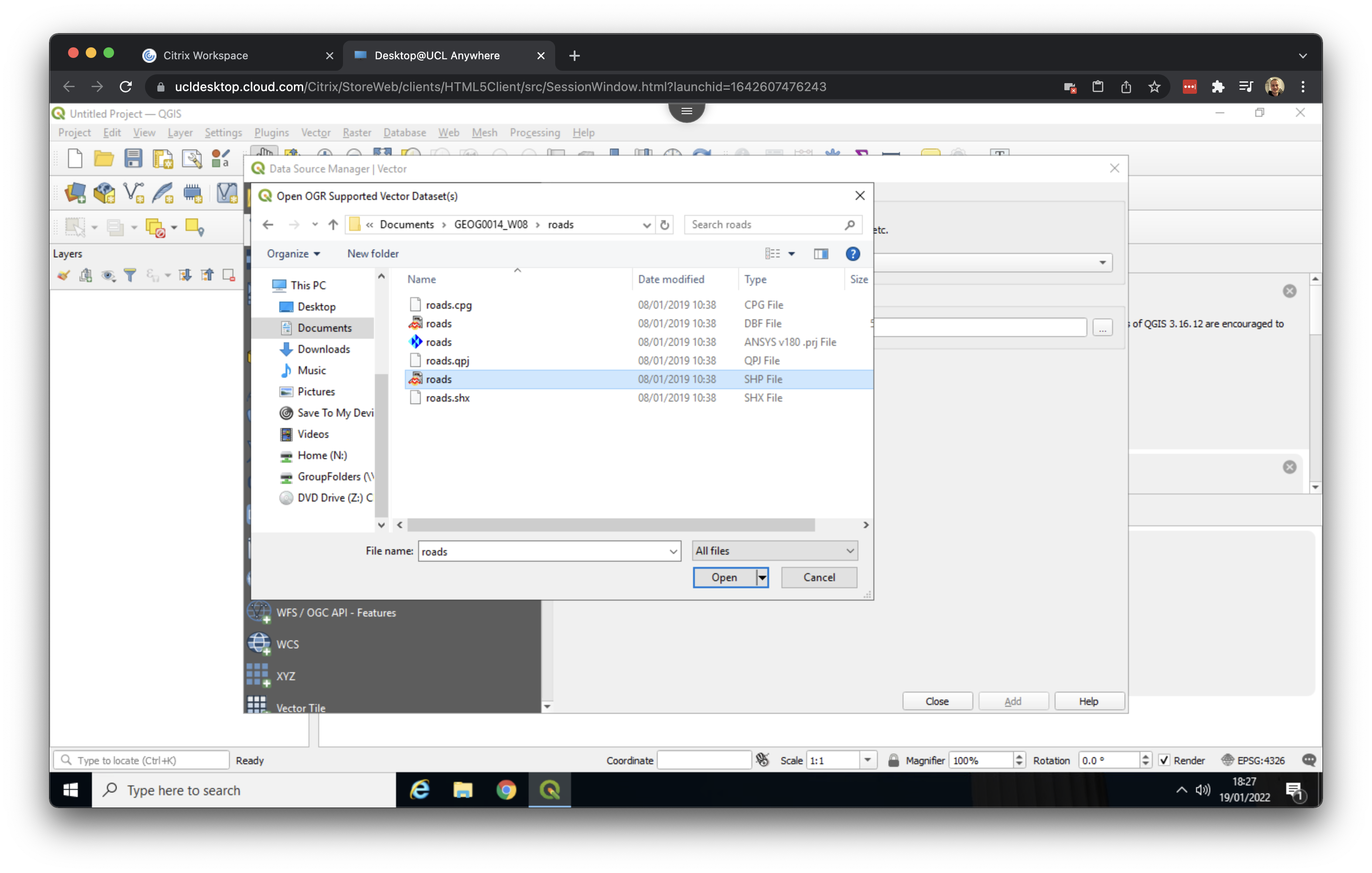
Click Open. Then click Add. If you get a message popping up saying something about Select Transformations for roads just click on OK. Now Close the dialog box. You should now see the road network of Camden and Islington loaded:
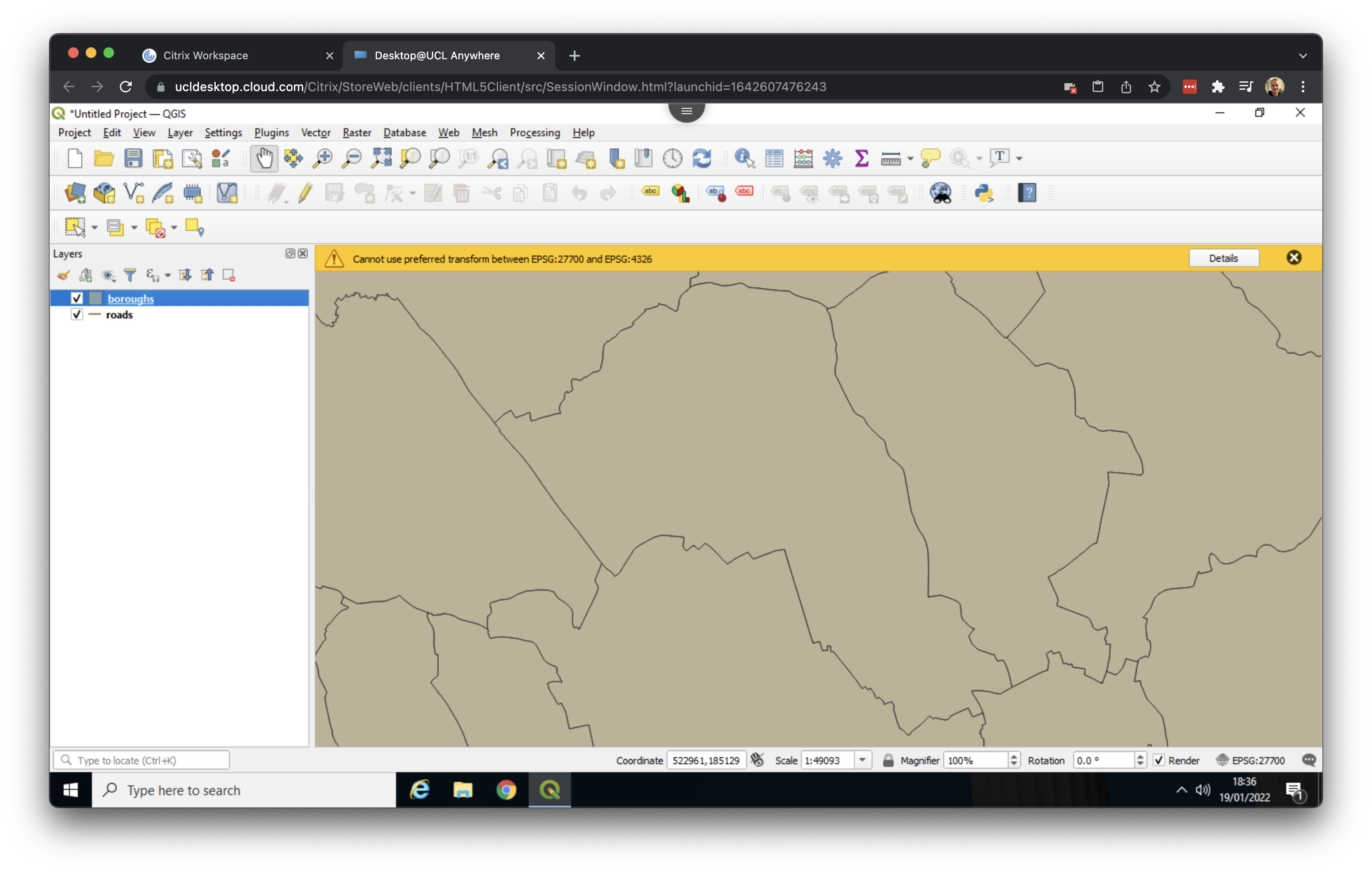
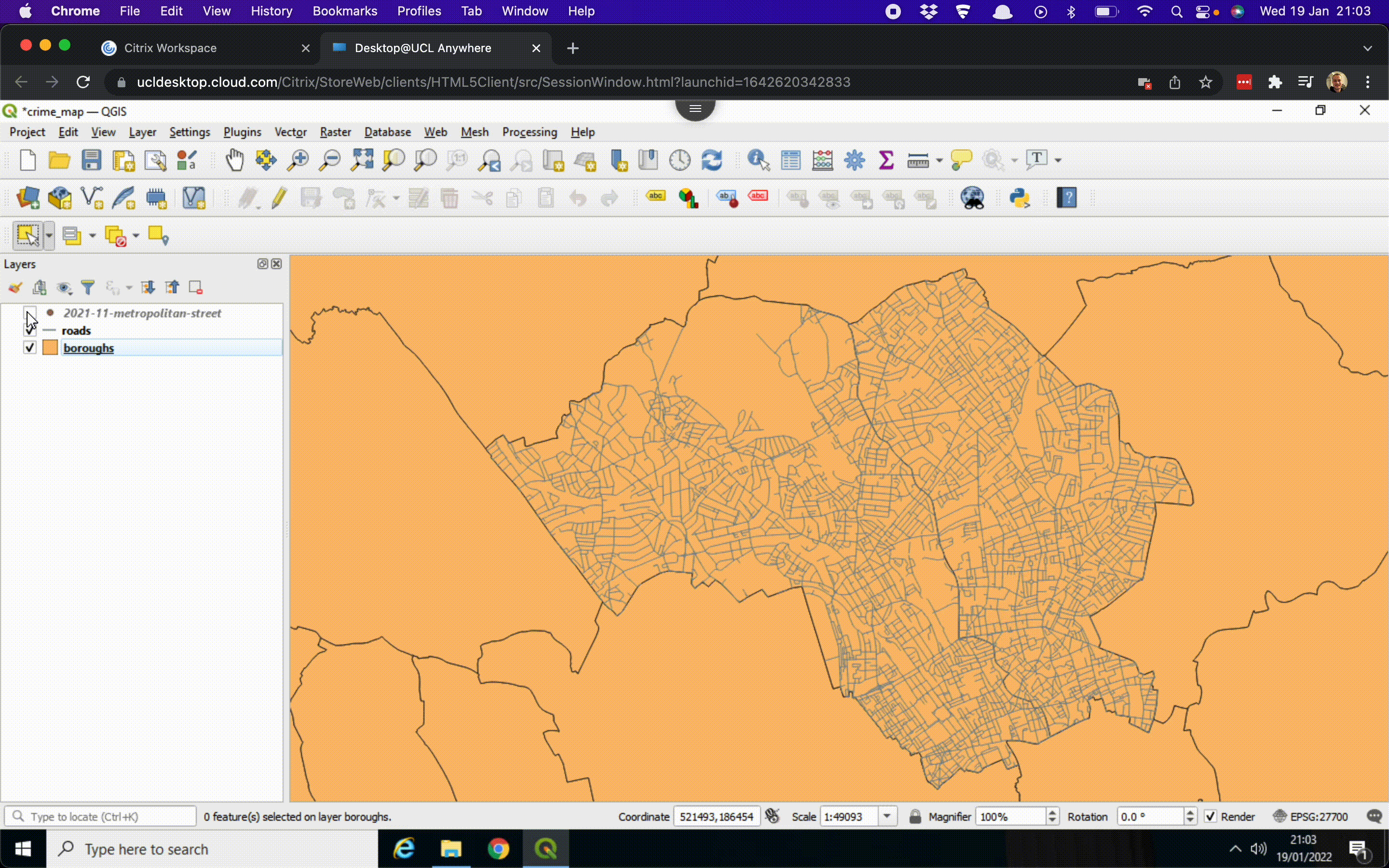
Now repeat these steps for our boroughs file, making sure again that inside your boroughs folder you select the boroughs file with the SHP File type. You now will have both data loaded, although the boroughs layer will be drawn on top of your roads layer.
QGIS randomly picks a colour when a map layer is first loaded, so the colours of your roads and boroughs file may be different than the ones shown in the screenshots.
2.3 Organising our layers
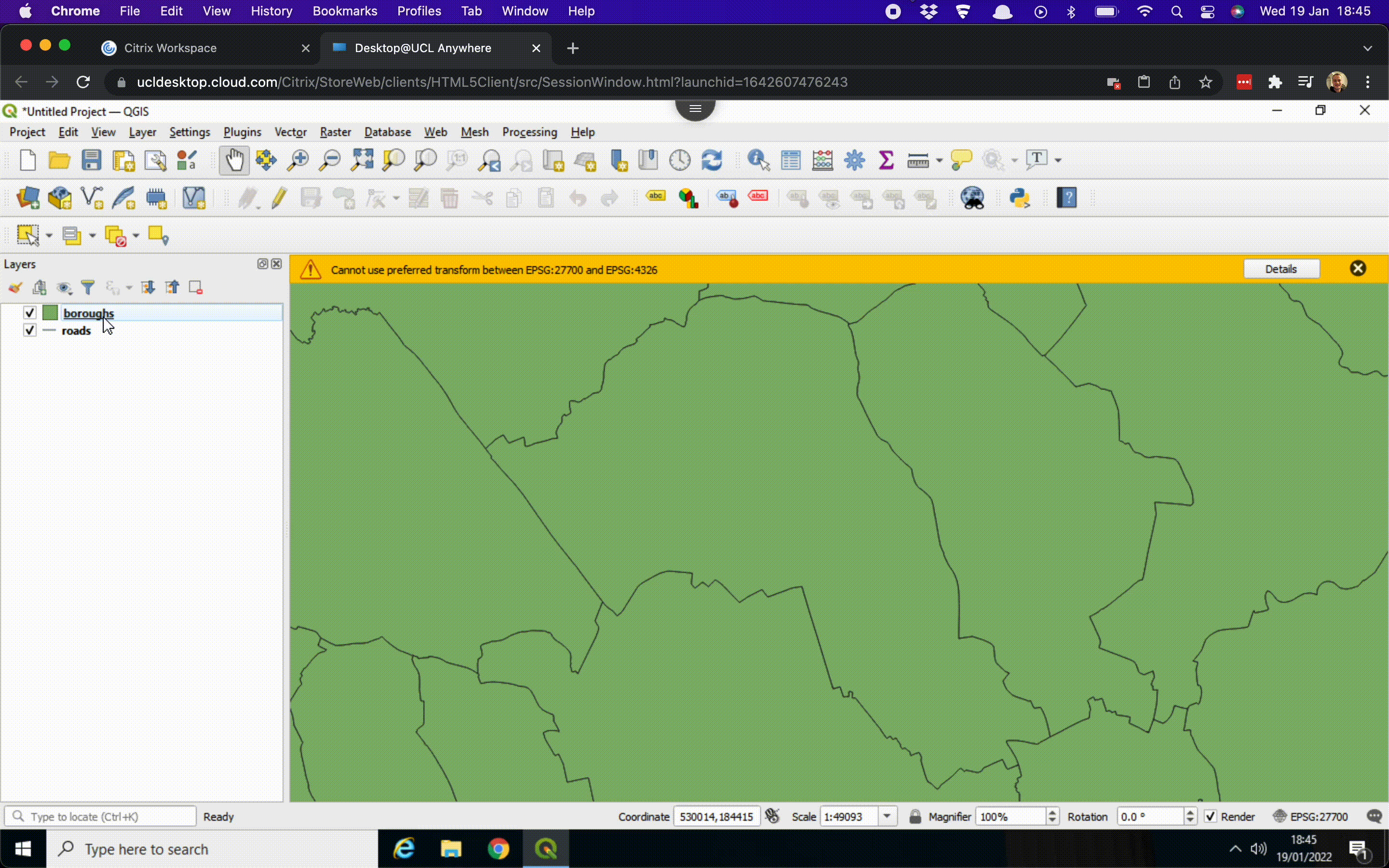
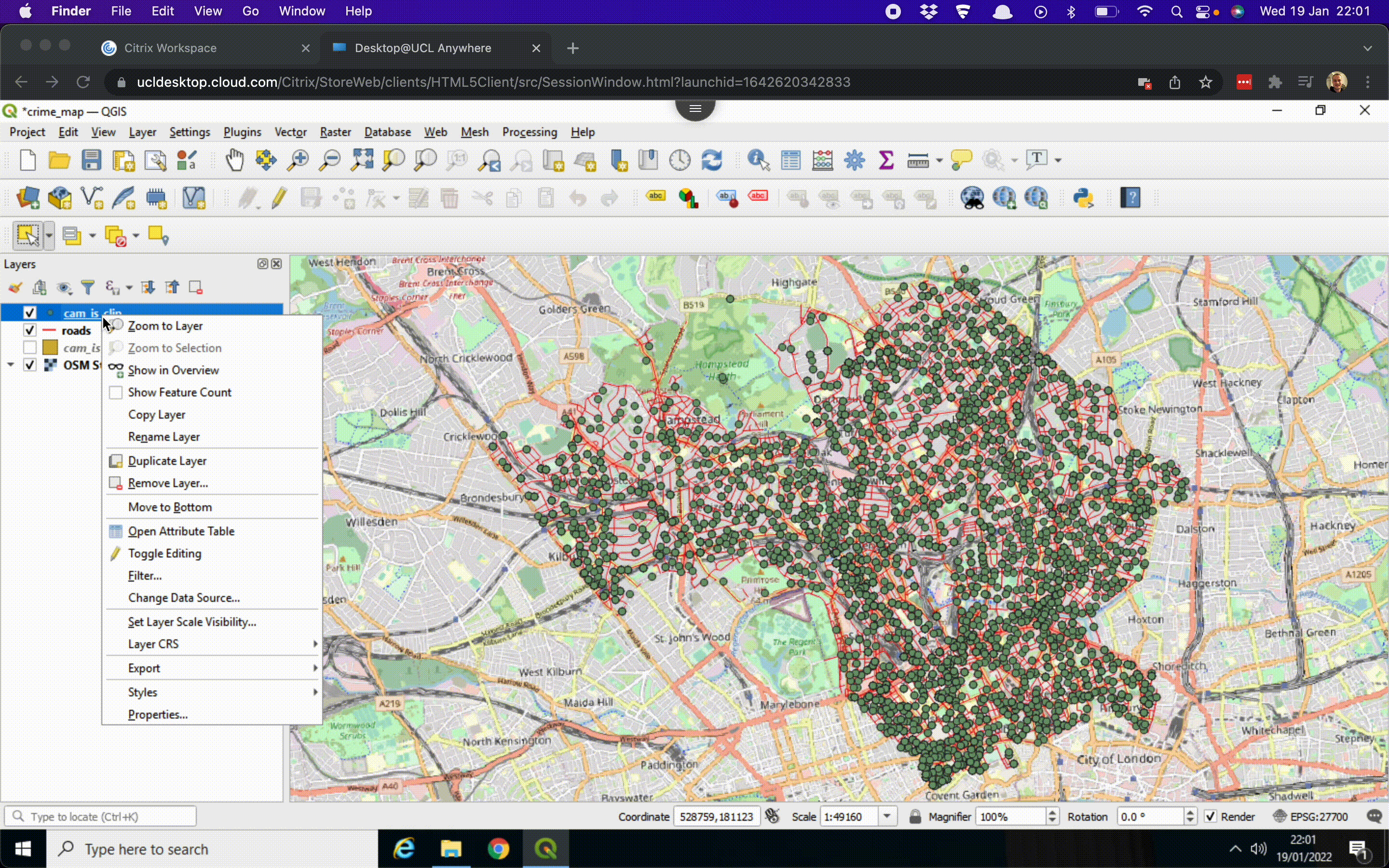
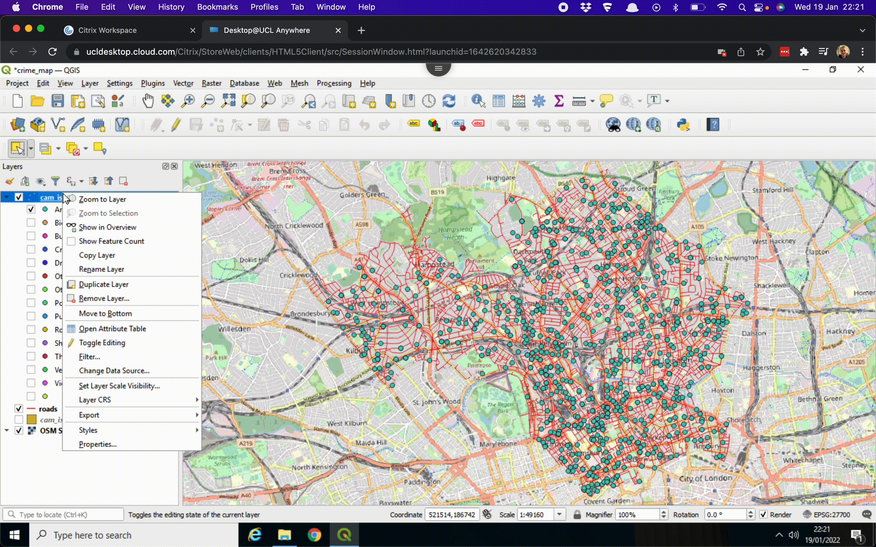
Now we have our first set of data loaded, we can reorganise their drawing order. In the Layers panel, we can drag the roads layer on top of the boroughs layer to change the drawing order. We can also zoom to a layer’s full extent (right click on roads or boroughs > Zoom to Layer), change a layer’s colour (right click on roads or boroughs > Properties … > change the colour under the Symbology tab), and zoom in and out of the map by scrolling:
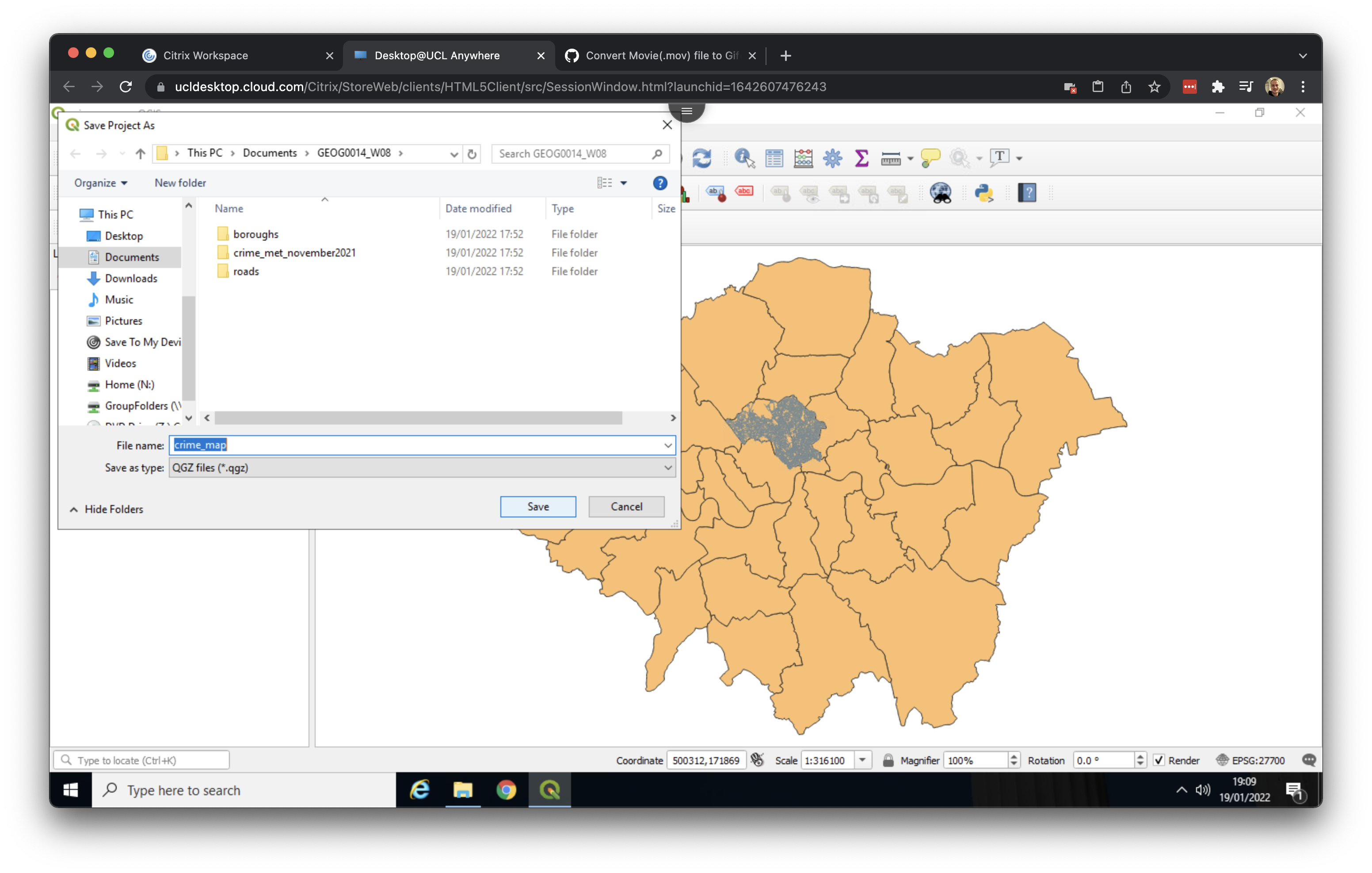
Before doing anything else, now would be a good time to save our QGIS project. Go to Project > Save as and save your file in your working directory as crime_map.
2.4 Inspecting our data in Excel
Next, we will take a closer look at the crime data we downloaded before importing it into QGIS.
The crime file we downloaded is in a csv format, which stands for comma-separated values. A csv file can be thought of as a simplified version of an Excel spreadsheet, where each column of data is separated by a comma. When you open a csv file in Excel, it appears in a standard table format.
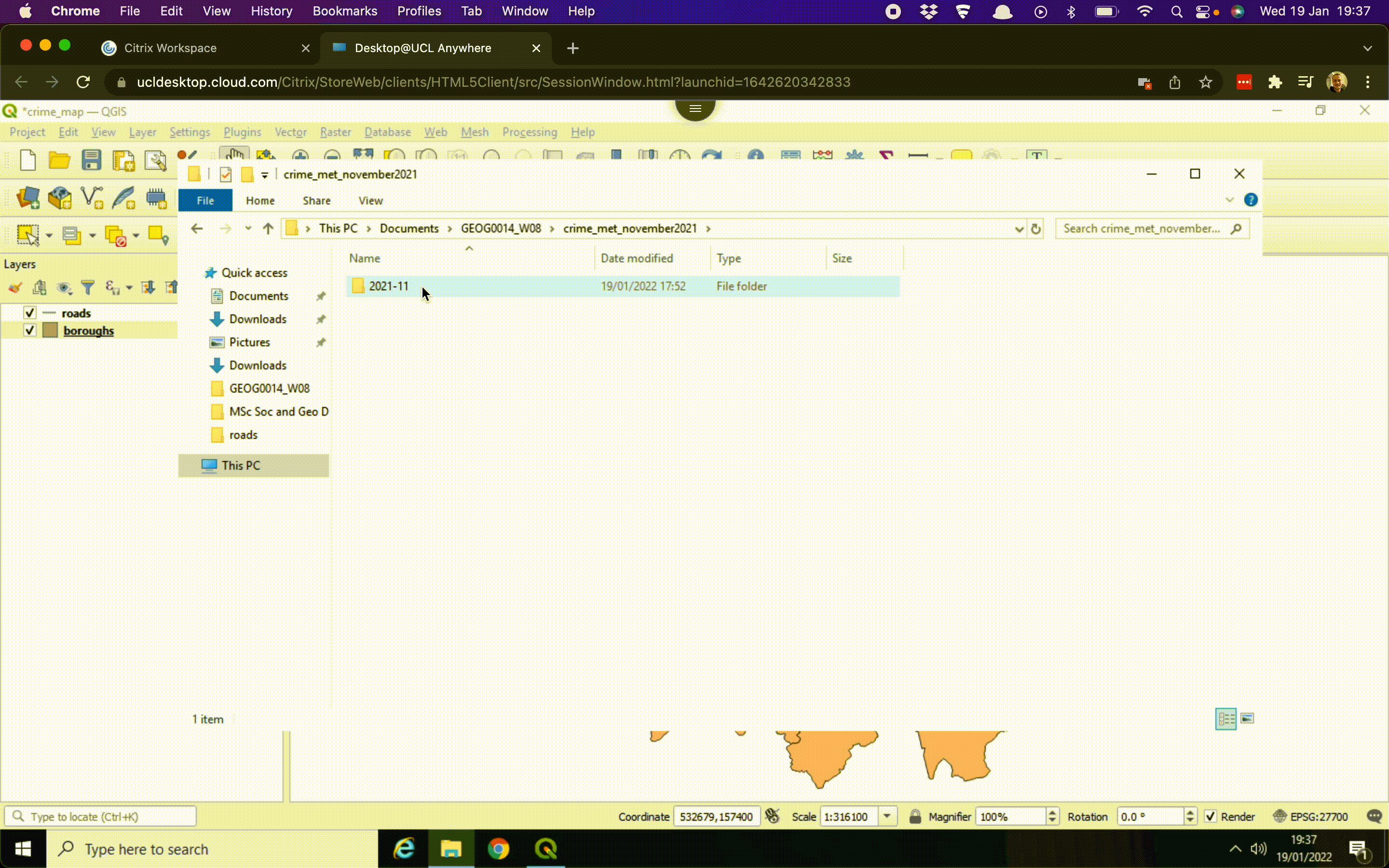
Navigate to your working directory and go to crime_met_november2023 > 2023_11. Now open the 2023-11-metropolitan-street file using Excel.
csv. [Enlarge image]Besides a column containing a unique Crime ID as well as the Month in which the crime has been recorded, our crime data set contains several other columns of data:
| Column | Meaning |
|---|---|
Reported by |
The force that provided the data about the crime. |
Falls within |
The area in which the crime was recorded. |
Longitude and Latitude |
The anonymised coordinates of the location of the crime. |
LSOA code and LSOA name |
References to the Lower Layer Super Output Area that the anonymised point falls into, according to the LSOA boundaries provided by the Office for National Statistics. |
Crime type |
One of the crime types used to categorise the offence. |
Last outcome category |
A reference to whichever of the outcomes associated with the crime occurred most recently. |
Context |
A field provided for forces to provide additional human-readable data about individual crimes. |
The main fields of interest for us are Longitude and Latitude (which we will use to plot the crimes in QGIS) and Crime type (to filter crimes by type). After reviewing the data, you can close Excel.
Please ensure that you do not save any changes to the file.
2.5 Loading our data into QGIS
Now we know what we are dealing with, we can load our crime data into QGIS. To do so, there are several steps we need to take:
- Go to Layer > Add Layer > Add Delimited Text Layer …. Because our data is a
csvfile we need to load it as a file in which columns are delimited by a certain character; a comma in our case. - Click on the three dots (…) next to the File name box and navigate to your working directory. Then go into your
crime_met_november2023folder, your2023-11folder, and Open the2023-11-metropolitan-streetfile. - Under Geometry Definitions make sure that X field is set to
Longitudeand Y field is set toLatitude. This informs QGIS that we are working with geographical locations. - To specify the map projection used for recording the crime locations, click on the Select CRS button. You will find this is directly next to the
invalid projectionselection. - In the Filter box type:
EPSG 4326. Only one option should show up:WGS 84. Select this option and click OK. - Now click Add. The data may take a little bit of time to load. Click Close to exit the dialog box.
The GIF below summarises these steps:
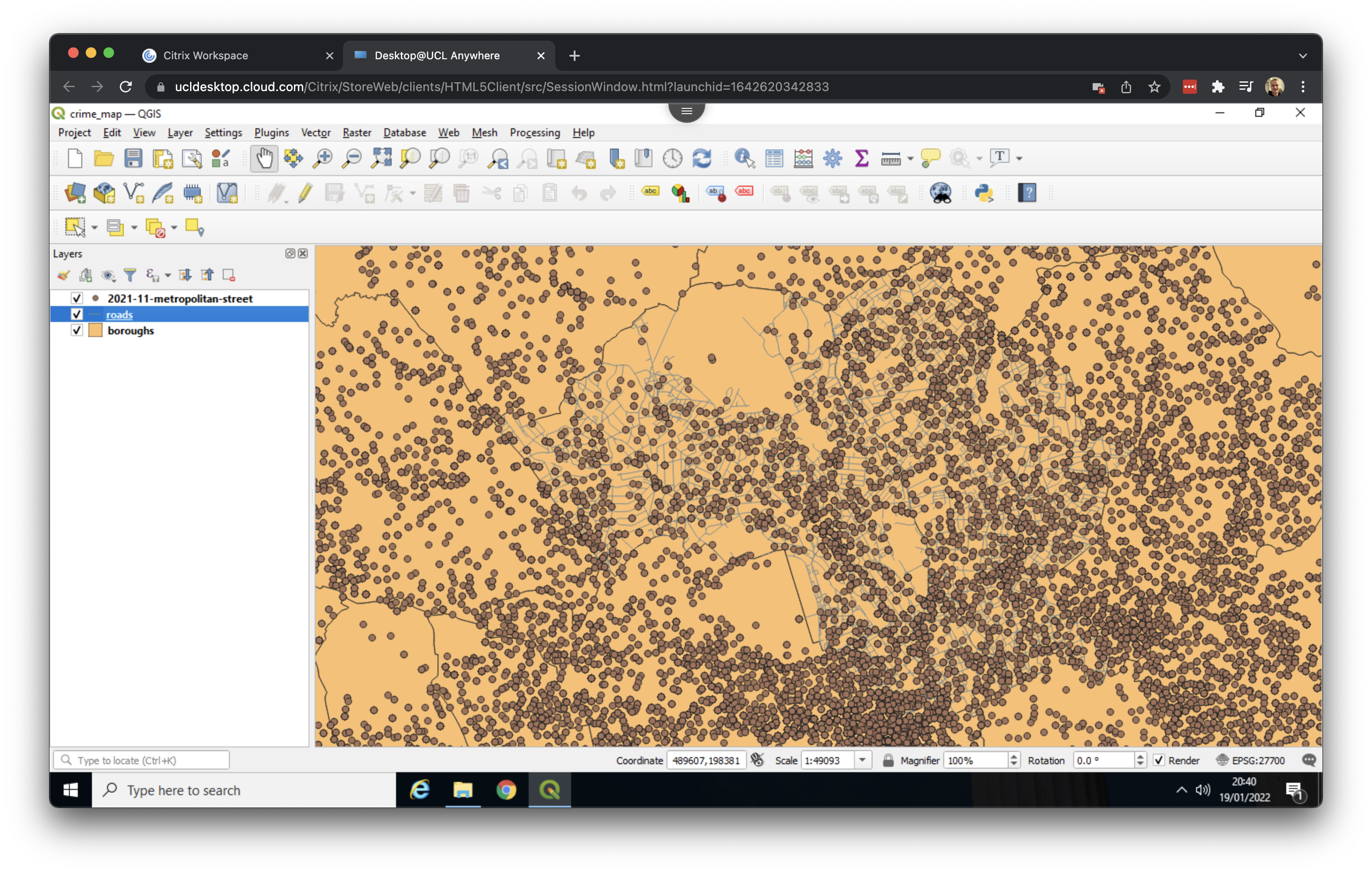
Here we now have every crime reported for the month November 2023 appearing across all of London. We can zoom to the Camden and Islington by right clicking on the roads layer and opting for Zoom to Layer:
2.6 Making selections
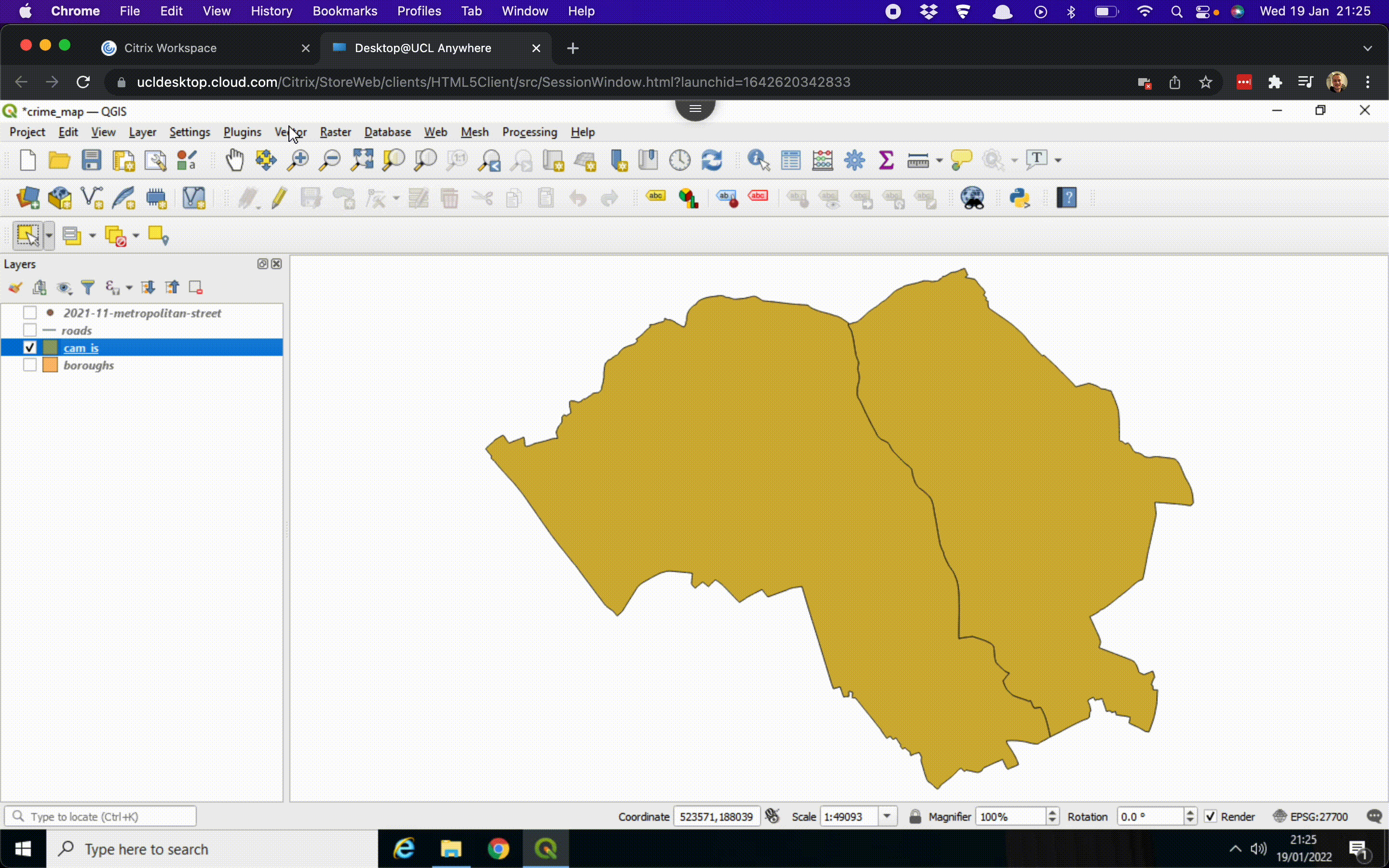
Because the crime data set covers the whole of London, and even records some crimes in locations outside of London, QGIS may get a little slow. As our focus is solely on crimes in Camden and Islington, we will filter the dataset to retain only the relevant incidents. This process involves two steps: first, we will export the boundaries of Camden and Islington as a separate file, and then we will select the crimes that fall within those boundaries. We will start by exporting the boundaries of Camden and Islington:
- Untick the boxes of the
roadsand2023-11-metropolitan-streetlayers in the Layers panel to deactivate them. - Select the
boroughslayer by clicking on it. - Click on the Select Features by Area or Single Click button:
The Select Features by Area or Single Click button may be found at a different position in the menu than shown in the GIF below.
- Press and hold the Shift button on your keyboard and click on Camden and Islington.
- Right click on the
boroughslayer in the Layers panel > Export > Save Selected Features As …. - Set the Format to Esri Shapefile.
- Click on the three dots (…) next to File name, navigate to your working directory and Save the file as
cam_is. - A new layer should now appear and you can untick the box next to the
boroughslayer.
The GIF below summarises these steps:
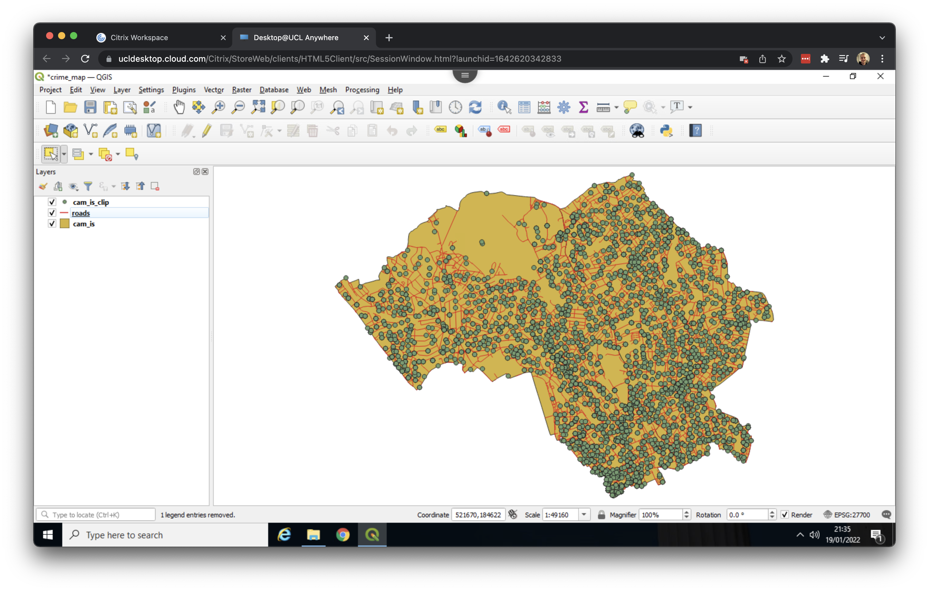
The next thing to do is to extract only those crimes that fall within the boundaries of our newly created shapefile:
- Go to Vector > Geoprocessing Tools > Clip ….
- Set
2023-11-metropolitan-streetas Input layer and setcam_isas Overlay layer. - Click on the three dots (…) next to the empty box with [Create temporary layer] and opt for Save to File …. Navigate to your working directory and type in
cam_is_clipas File name. Change Save as type toSHP files (*.shp)and click Save. - Click Run. This may take a few seconds. Once the process is done, you can click Close.
We have now successfully filtered the dataset to include only the crimes that occurred within the boundaries of Camden and Islington. The GIF below summarises these steps:
Before moving to our visualisation, we can remove the 2023-11-metropolitan-street layer by right clicking on the layer in the Layers panel and opting for Remove Layer…. We can do the same for the boroughs layer. Our QGIS screen should now look something like this:
Do not forget to save your progress once a while!
2.7 Visualising data
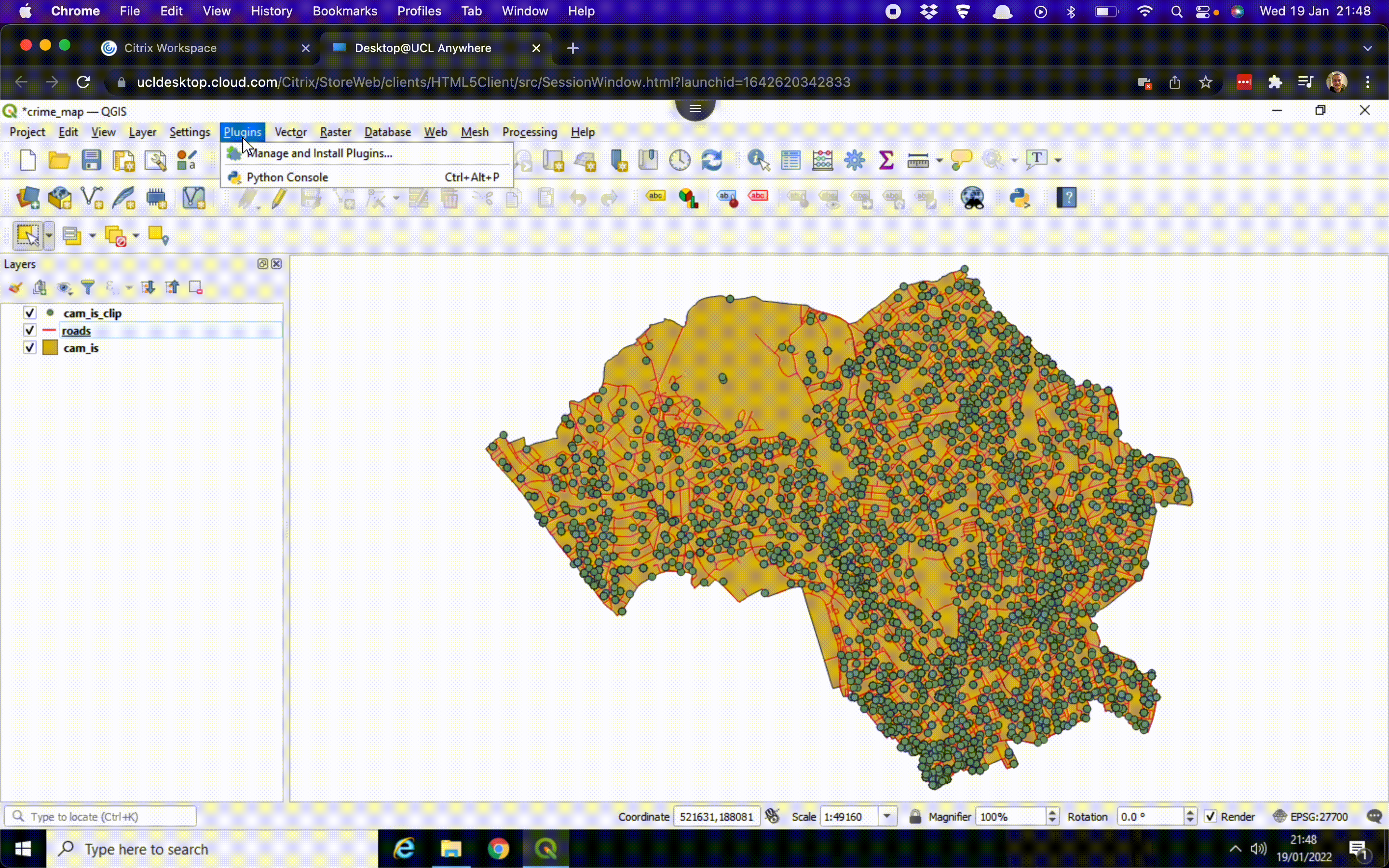
Based on the shapes of the streets and the outline of the street network, you may already recognise some streets. However, to provide additional context, we can add a base map layer. A base map is a background layer with geographic information that enhances the visual context of your map. To add a base map, we will need to install a plugin. We can do that as follows:
- Go to Plugins > Manage and Install Plugins.
- Search for QuickMapServices and click on Install plugin.
- Once the plugin is installed you can go to Web > QuickMapServices > OSM > OSM Standard. It may take a few seconds to load the base map.
- Turn off the Camden and Islington map layer (
cam_is) in the Layers panel by unticking it.
OSM stands for OpenStreetMap. OpenStreetMap is a collaborative project to create a free editable geographic database of the world, comparable to Wikipedia but then for spatial information.
You now have a view of the street data, pulled from OpenStreetMap, with the crime data drawn on top. The GIF below summarises these steps:
The next thing we want to do is get some more insight into our crimes. As we know: the data records crime by type, so we can use this information in our visualisation:
- Right click on the
cam_is_cliplayer in the Layers panel and click on Properties …. Here we can change the symbology of the layer. - At the top of the menu change Single Symbol to Categorized.
- Click on the Value drop-down menu and select
Crime type. Note that these are the columns that we have seen when we looked at the data in Excel. - At the bottom of the menu click on Classify. All the different crime types now appear, with each their own symbol. Click Apply and subsequently click OK.
The QGIS screen now shows a colour for each crime type. The GIF below summarises these steps:
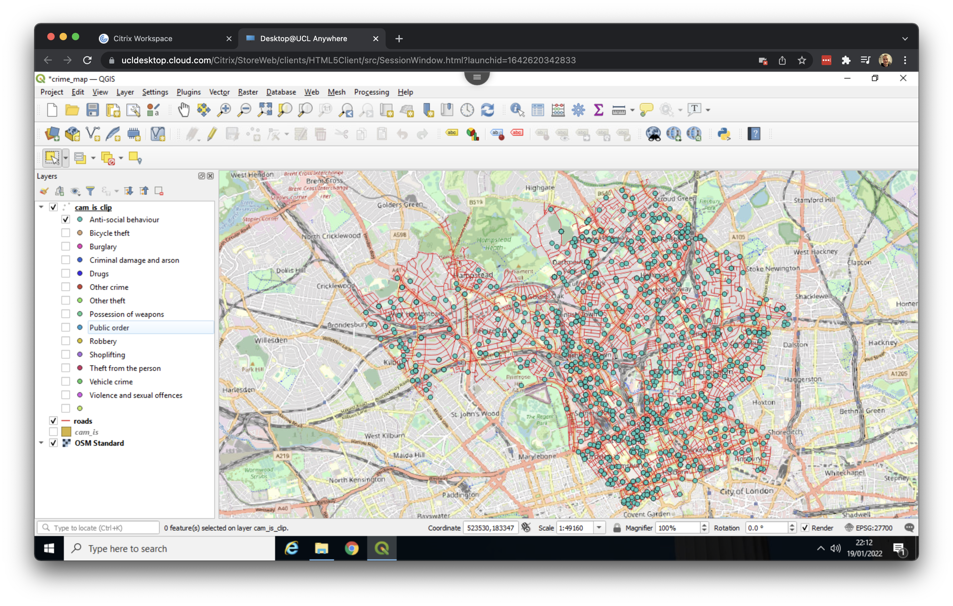
In the Layers panel, you can now expand the cam_is_clip layer and switch on and off individual crime types by ticking or unticking their respective boxes:
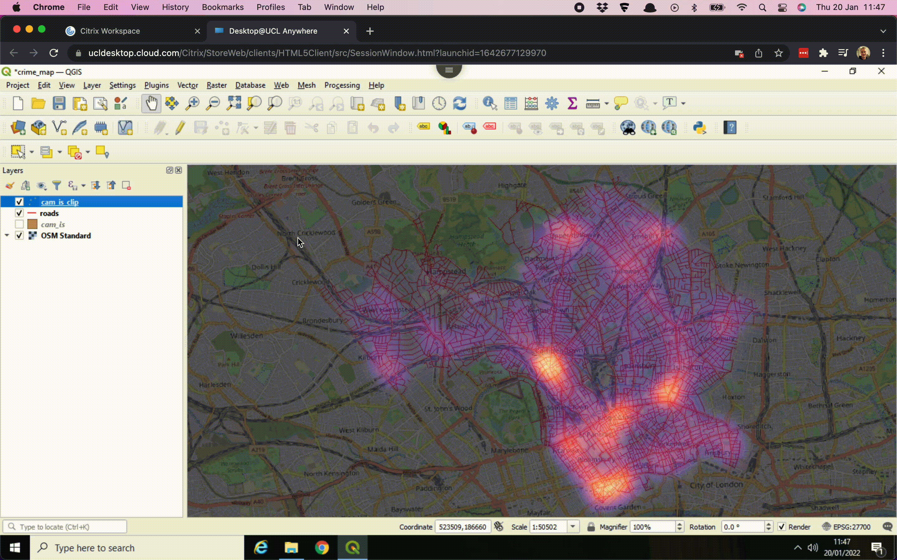
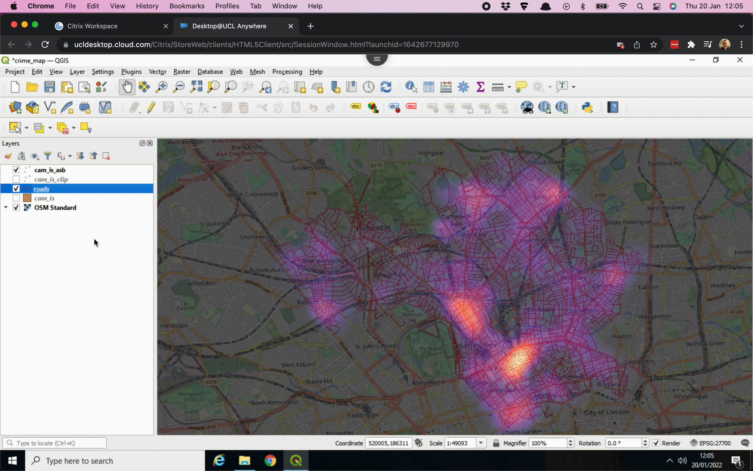
In addition, we can create a hotspot or heatmap. QGIS can do this automatically by mapping the density of the points:
- Right click on the
cam_is_cliplayer in the Layers panel and click on Properties …. Here we can change the symbology of the layer. - At the top of the menu change Single Symbol to Heatmap.
- Using the drop-down menu, change the Color ramp to Magma for perhaps a more exciting map.
- Under Layer Rendering set the Opacity to 60%, so to blend the heatmap with the OSM basemap. Click Apply - this may take a few seconds. Then click OK.
We now have created a straightforward visualisation of the density of crimes in Camden and Islington. The GIF below summarises these steps:
The resulting map is relatively dark. For your worksheet assignment you may want to select a different colour ramp or you may try to edit the Magma colour ramp by setting the first colour of the Color ramp transparent: instead of changing the Color ramp to Magma, select the Edit Color Ramp … option. Here you can set Color 1 to Transparent. You can further adjust the colours by playing around with the Gradient Stops in the same menu. Once you are happy with the changes you have made to the colour palette click OK. Then click Apply followed by OK to exit the menu.
But what if we only want to create a density map only for a given crime type such as anti-social behaviour? We can do that as follows:
- Right click on the
cam_is_cliplayer in the Layers panel and click on Open Attribute Table. - In the Attribute Table click on the button that says Select Features Using Expression:

- Double click on
Crime typein the Fields and Values drop-down menu. Thecrime typevariable now gets added to the Expression. - Directly next to the
"Crime type"part of the expression type=. - Now click on the All Unique button to get all unique values that are stored in the
crime typevariable. Double click on Anti-social behaviour to add this to the expression. - Click on select Features and Close the dialogue box and the Attribute Table. The selected crimes should now show up in yellow.
Just as we did before with our two boroughs, we can export our selection to a new shapefile:
- Right click on the
cam_is_cliplayer in the Layers panel > Export > Save Selected Features As …. - Set the Format to Esri Shapefile.
- Click on the three dots (…) next to File name, navigate to your working directory and Save the file as
cam_is_asb. - A new layer should now appear and you can untick the box next to the
cam_is_cliplayer.
Once you have a new layer, you can update the symbology again to create a heatmap. The GIF below summarises these steps:
shapefile. [Enlarge image]2.8 Creating a map
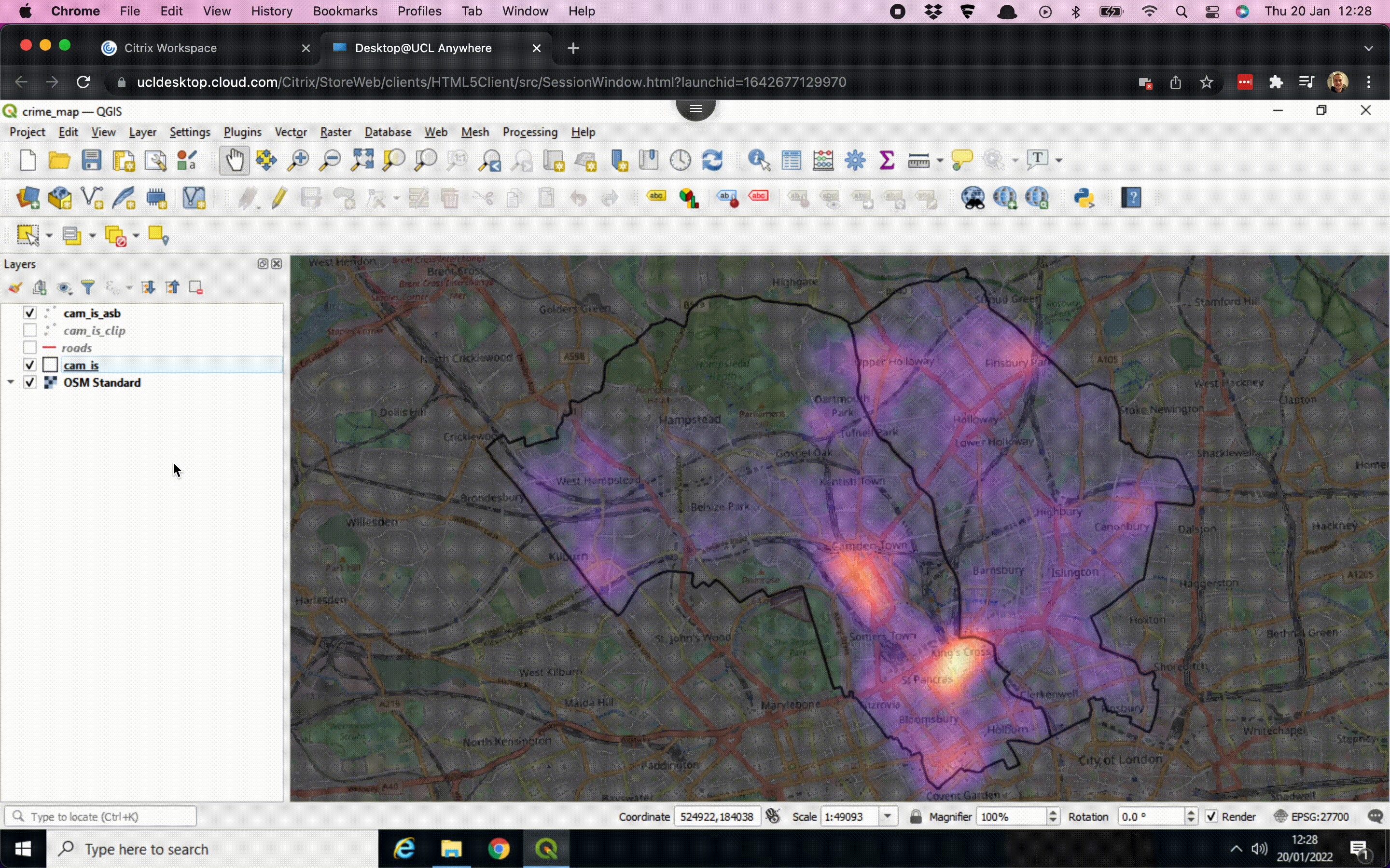
We have been through the key steps that we need to create the map, however, there are some other things we can do. For instance, if we want to put the borough outlines on, we can:
- Tick the box next to the
cam_islayer in the Layers panel to switch the layer back on. - Right click on the
cam_islayer and choose Properties. - Under the Symbology tab we can make some adjustments to the Simple Fill settings: in this case we can set the Fill style to No brush. We can also make the outline thicker by increasing the Stroke width. Once this is done click Apply followed by OK.
The GIF below summarises these steps:
The final step is to refine the styling and export the map from QGIS, which we will accomplish using the Print Layout:
- Go to Project > New Print Layout ….
- Give it a name, e.g.
crime_asb. - A new window opens up. In the toolbar on the left hand side, click on the Add map button:

- Draw a box on the canvas. The crime map should now appear.
- Using the toolbar on the left hand side, there is several other options such as Add scale bar, Add North Arrow, and Add Legend. There are lots of options to play around with!
- Once you are happy with your map, you can save your map by going to Layout > Export as Image …. If you get a message popping up saying something about Project Contains WMS Layers just click on Close. Navigate to your working directory, give your map a name and click Save. Also click Save on the next window that pops up.
These steps should create an image which you should be able to find in your working directory. The GIF below summarises these steps:
You can export the map as png or jpeg for usage outside QGIS.
The map we have created now needs some attention to its styling. QGIS offers a wide range of options for customising the appearance of your maps, so feel free to experiment with different colours and settings. Have a look at the QGIS tutorial on Using the Print Layout and QGIS manual on Laying out maps.