7 Raster data and geostatistics
7.1 Introduction
During this week, we will continue to work with point data by providing you with a more in-depth and detailed explanation behind the geostatistics methods of interpolation of point data, looking at various deterministic and geostatistical techniques. Because some of these techniques yield a raster dataset as an output, we will start by focusing on raster data and its applications.
This week is structured around two short lecture videos, one assignments that you need to do in preparation for Friday’s seminar, and the practical material. As always, this week’s reading list is available on the UCL library reading list page for the course.
7.1.1 Video: Overview
[Lecture slides] [Watch on MS stream]7.2 Raster data and map algebra
In the previous weeks, we have predominantly worked with vector data. However, depending on the nature of your research problem, you may also encounter raster data. Each of these GIS models has its own advantages and disadvantages.
).](images/week07/07_raster_and_vector.png)
Figure 7.1: A hypothetical raster and a vector model of landuse (ESRI 2019).
The main difference between vector and raster model is that raster datasets are composed of pixels (or grid cells), while vector dataset are composed of geometric points and lines (paths). This means that a raster dataset represent a geographic phenomemon by dividing the world into discrete rectangular cells laid out in a grid. Each cell holds one value that represents some characteristic of that gric cell’s location. Probably one of the most common or well-known types of raster data is land cover derived from satellite imagery, however, there are many situations in which raster datasets are used.
Within R, we can use the functions from the raster package for reading, writing, manipulating, analysing, and modelling raster data; however, before we do that let’s first dive a little deeper into raster data and map algebra.
7.2.2 Example: Raster data and map algebra
For the first part of this week’s practical material we will be using raster datasets from the Population Change and Geographic Inequalities in the UK, 1971-2011 (PopChange) project. In this ESRC-funded project, researchers from the University of Liverpool created raster population surfaces from publicly available Census data (1971, 1981, 1991, 2001, 2011). Population surfaces are estimates of counts of people for regular grids, for example, population in a certain subgroup over 1km by 1km grid cells. In the example below, we will be using the 2001 and 2011 Age 30-44 years population surfaces but feel free to choose and download two different datasets through to https://popchange-data.liverpool.ac.uk/.
Questions
- Small-area counts of people in a variety of population subgroups are publicly released for each Census, so why was it necessary to create these raster population surfaces?
File download
| File | Type | Link |
|---|---|---|
| Population surface GB 2001 - Age 30-44 | asc |
Download |
| Population surface GB 2011 - Age 30-44 | asc |
Download |
| Local Authority Districts London 2020 | shp |
Download |
If you did not download two dataset directly from the PopChange data resource, download the individual files above to your own computer and as usual make sure your data directory is set up correctly and the data are unzipped where necessary.
Before we open up the data in R, try to have a ‘non-spatial sneak peak’ at the .asc file by opening it in a normal texteditor, for instance, TextEdit on Mac OS or NotePad on Windows. What you will notice is that the asc file, which is an exchange format, is in very fact a flat plain text file!
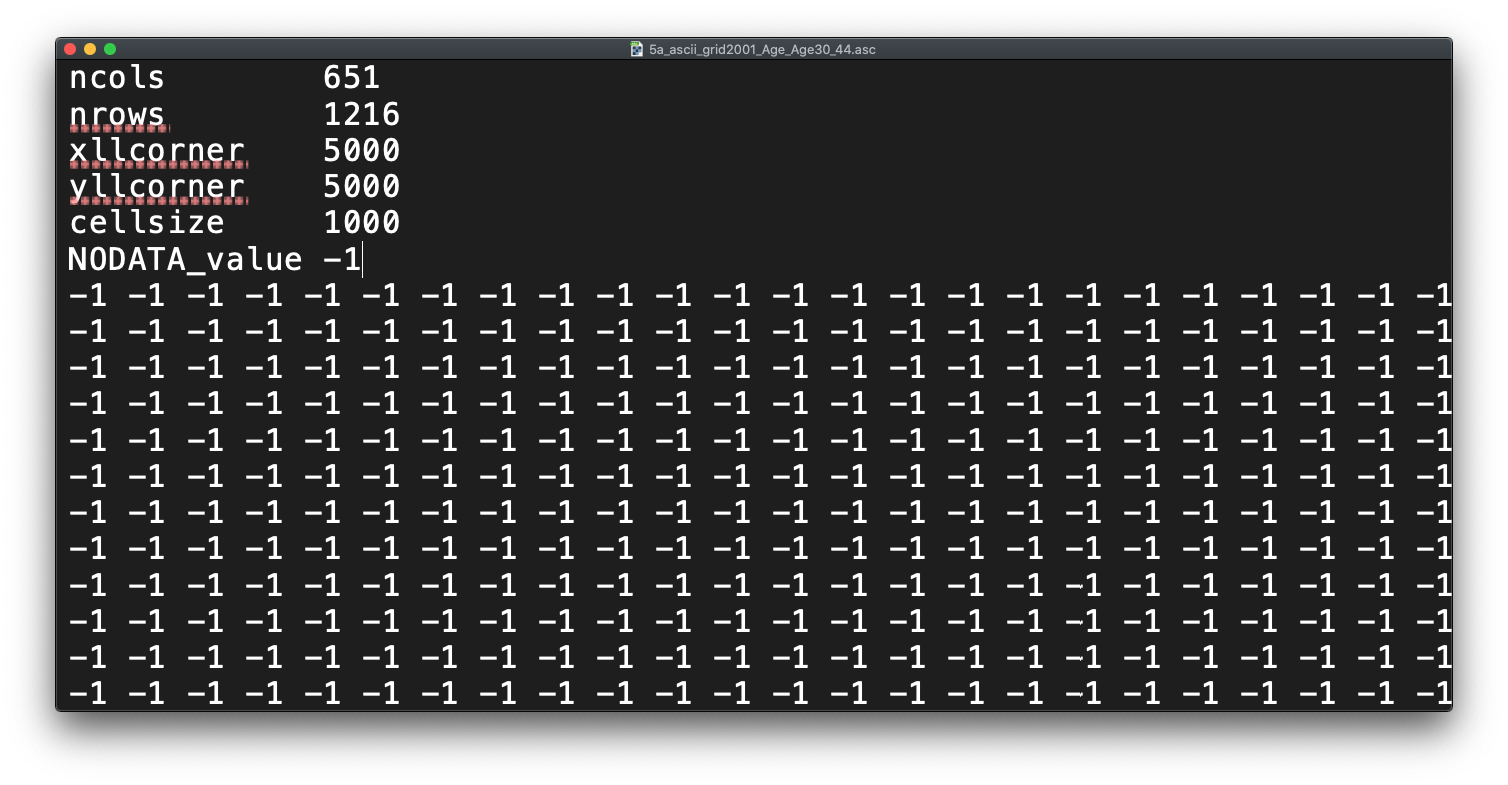
Figure 7.2: Raster or plain text?
Questions
- Any idea on what the first few lines of the
ascfile, when opened with a texteditor, mean?
# load libraries
library(raster)
library(RColorBrewer)
library(rgdal)
library(tmap)

# load data
pop01_3044 <- raster('raw/raster/5a_ascii_grid2001_Age_Age30_44.asc')
pop11_3044 <- raster('raw/raster/5a_ascii_grid2011_Age_Age30_44.asc')

# inspect 2001 // this can be a little slow, especially for large raster
plot(pop01_3044)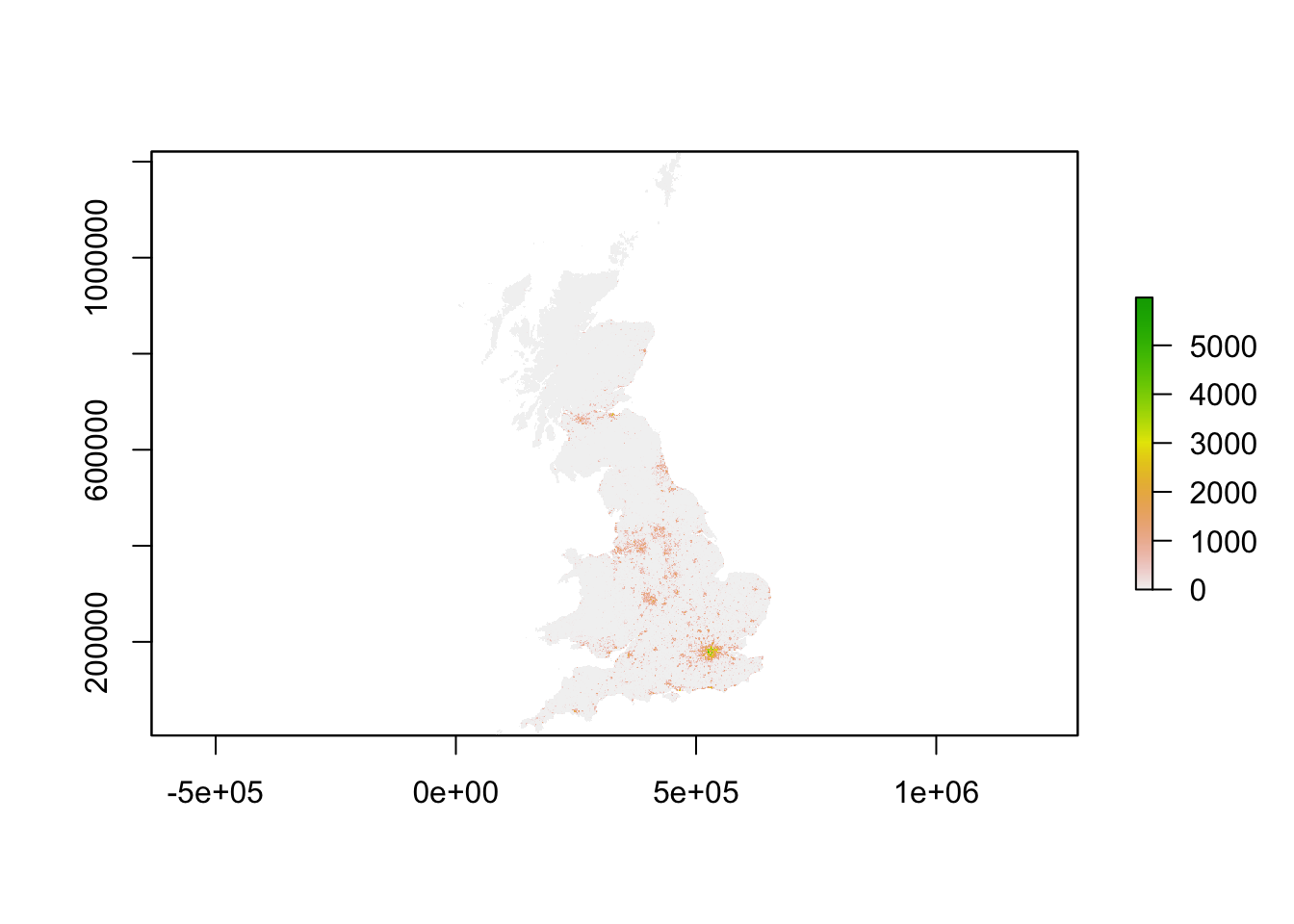
# plot 2011 // this can be a little slow, especially for large rasters
plot(pop11_3044)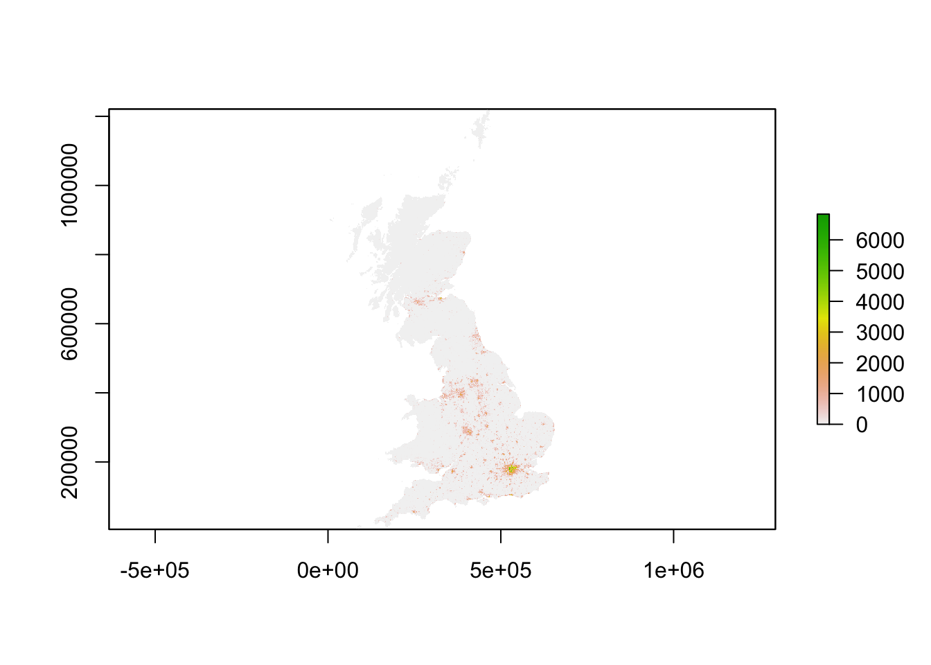
# plot pretty 2001 // this can be a little slow, especially for large rasters
plot(pop01_3044,col=brewer.pal(6,'Blues'),main='Population surface age 30 - 44 in 2011',axes=FALSE)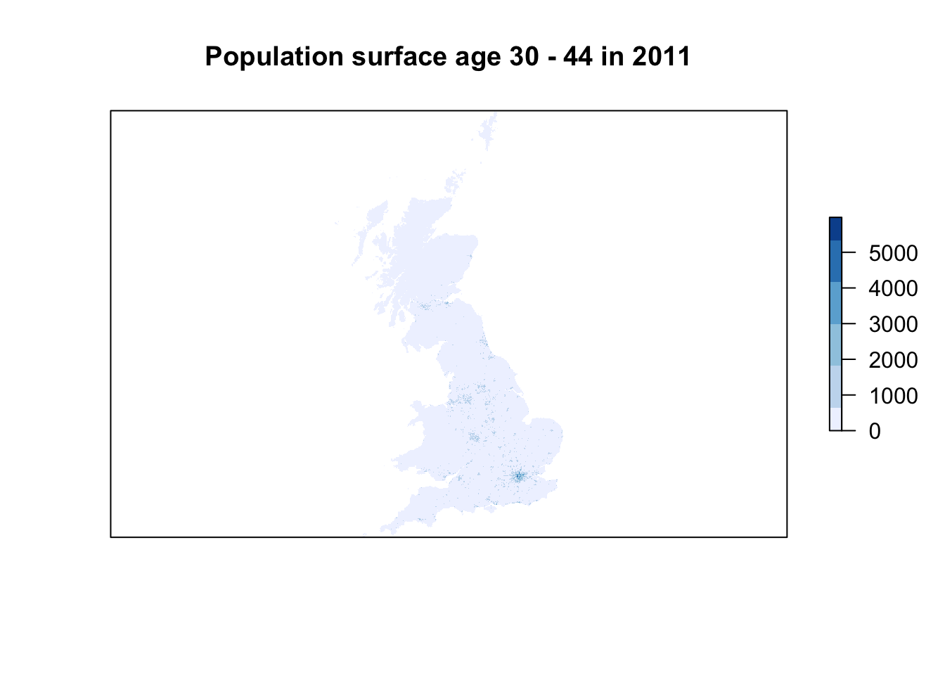
# plot pretty 2011 // this can be a little slow, especially for large rasters
plot(pop11_3044,col=brewer.pal(6,'Blues'),main='Population surface age 30 - 44 in 2011',axes=FALSE)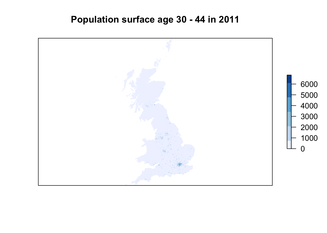
Questions
- The
plot()function automatically adds a legend to our raster dataset. What do these numbers represent?
Now all data are loaded, we have been able to quickly make a halfway decent map, we are ready to look a bit better at our raster dataset. In a way a raster dataset (or any raster image for that matter), can be thought of as a big matrix of n_rows by n_columns. Every cell in the matrix holds a value - because of this many standard descriptive techniques can be applied onto raster data. In very fact, we can do some algebra with these datasets!
Map algebra is a set-based algebra for manipulating geographic data, coined by Dana Tomlin in the early 1980s. Map algebra operations and functions are typically broken down into four groups: local, focal, zonal and global. We will explore them briefly in the remainder of this section. Let’s start, however, by confining our area to Greater London rather than using the whole of Great Britain.
# load data
lad <- readOGR(dsn='raw/boundaries/london_lad_2020/london_lad_2020.shp')
## OGR data source with driver: ESRI Shapefile
## Source: "/Users/Tycho/Dropbox/UCL/Web/jtvandijk.github.io/GEOG0114/raw/boundaries/london_lad_2020/london_lad_2020.shp", layer: "london_lad_2020"
## with 33 features
## It has 1 fields# clip raster to extent greater london
lon01_3044 <- crop(pop01_3044,extent(lad))
lon11_3044 <- crop(pop11_3044,extent(lad))
# inspect
lon01_3044## class : RasterLayer
## dimensions : 45, 58, 2610 (nrow, ncol, ncell)
## resolution : 1000, 1000 (x, y)
## extent : 504000, 562000, 156000, 201000 (xmin, xmax, ymin, ymax)
## crs : NA
## source : memory
## names : X5a_ascii_grid2001_Age_Age30_44
## values : 0, 6015.774 (min, max)# inspect
lon11_3044## class : RasterLayer
## dimensions : 45, 58, 2610 (nrow, ncol, ncell)
## resolution : 1000, 1000 (x, y)
## extent : 504000, 562000, 156000, 201000 (xmin, xmax, ymin, ymax)
## crs : NA
## source : memory
## names : X5a_ascii_grid2011_Age_Age30_44
## values : 0, 6836.724 (min, max)# transfer values raster values to shape of greater london
lon01_3044 <- rasterize(lad, lon01_3044, mask=TRUE)
lon11_3044 <- rasterize(lad, lon11_3044, mask=TRUE)
# plot
plot(lon01_3044)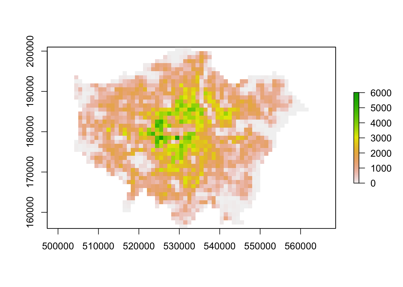
# plot
plot(lon11_3044)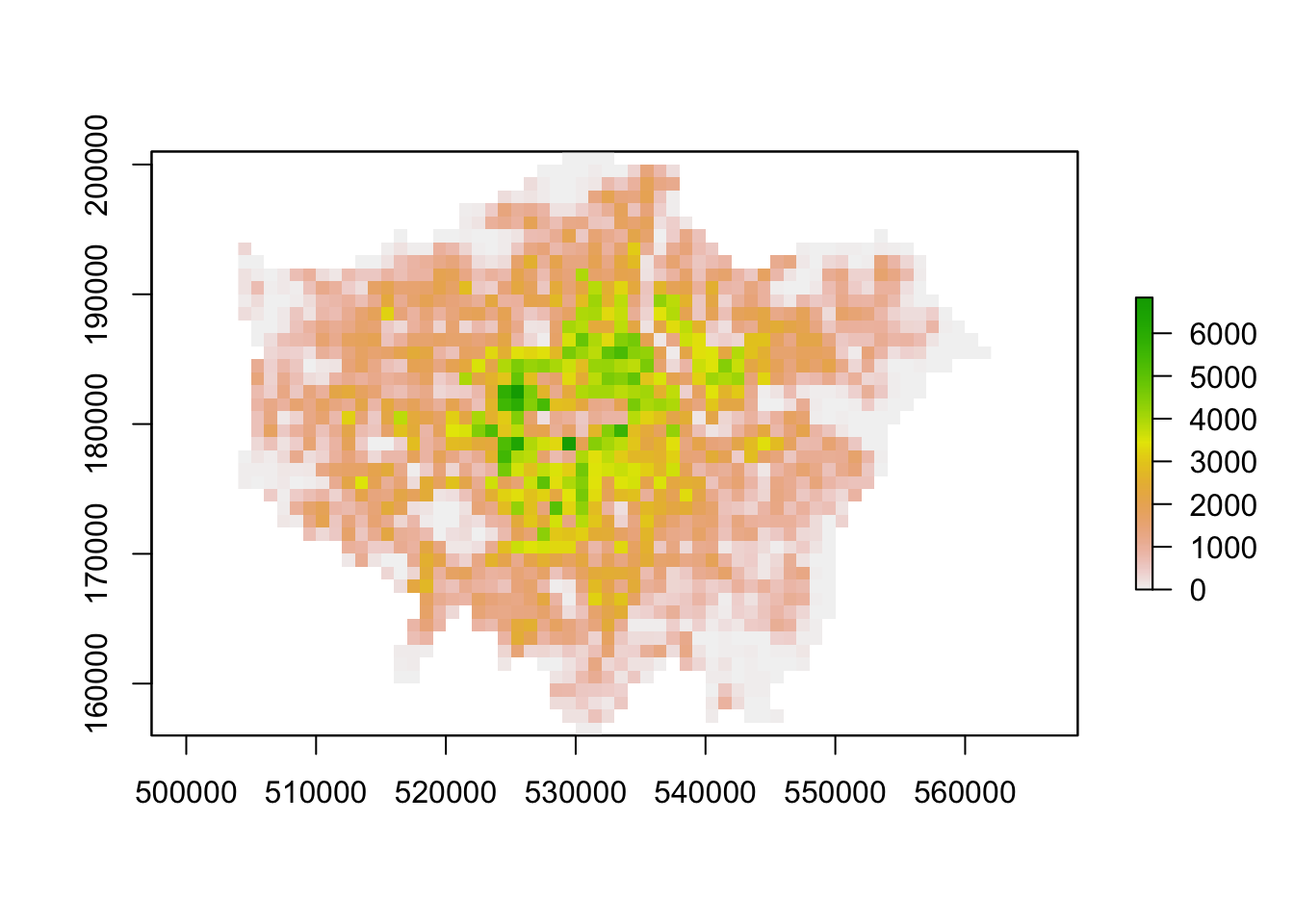
Local operations and functions are applied to each individual cell. In case of one raster this could be a reclassification of values. In case of multiple rasters the operations applied to each individual cell only involve the cells that share the same location. You can use mathematical operators to execute addition, substraction, division, etc., but you can also use boolean (or logical) operators such as AND, OR, or NOT. Boolean operators are particularly useful when combining multiple input rasters and you are trying to get an output raster that is conditioned on the input rasters.
Focal operations and functions assign the output of some neighbourhood function to each individual cell. For instance, the cell in the output raster could be the average of all 9 neighbouring cells. Focal operations require a kernel, that is a search window, to define the neighbourhood.
Zonal operations and functions aggregate the cells of an input raster based on some zonal definition, for instance, an administrative unit. In a way these operations and functions are similar to the focal operations, but the zonal definition comes from ‘outside’ the input raster.
Global operations and functions use some or all input cells to create an output raster. An example is the calculation of the shortest distance between a source point and every other cell in the input raster. The input raster here provides the resistance of the surface. A good example would be a raster dataset containing slope data where one would want to calculate what the path of least resistance (a least-cost path) is when moving from point A to point B.
Since we have two population surfaces, the local, focal, and zonal methods make most sense to use. Let’s calculate population change, smooth this population change, and lastly aggregate our population of 30-44 year to an administrative geography. If you wonder what some of the parameters in the functions do or mean, check the documentation for these functions! E.g. ?focal or ?zonal.
# example of local statistics: population change
lon_change <- lon11_3044 - lon01_3044

# inspect
plot(lon_change)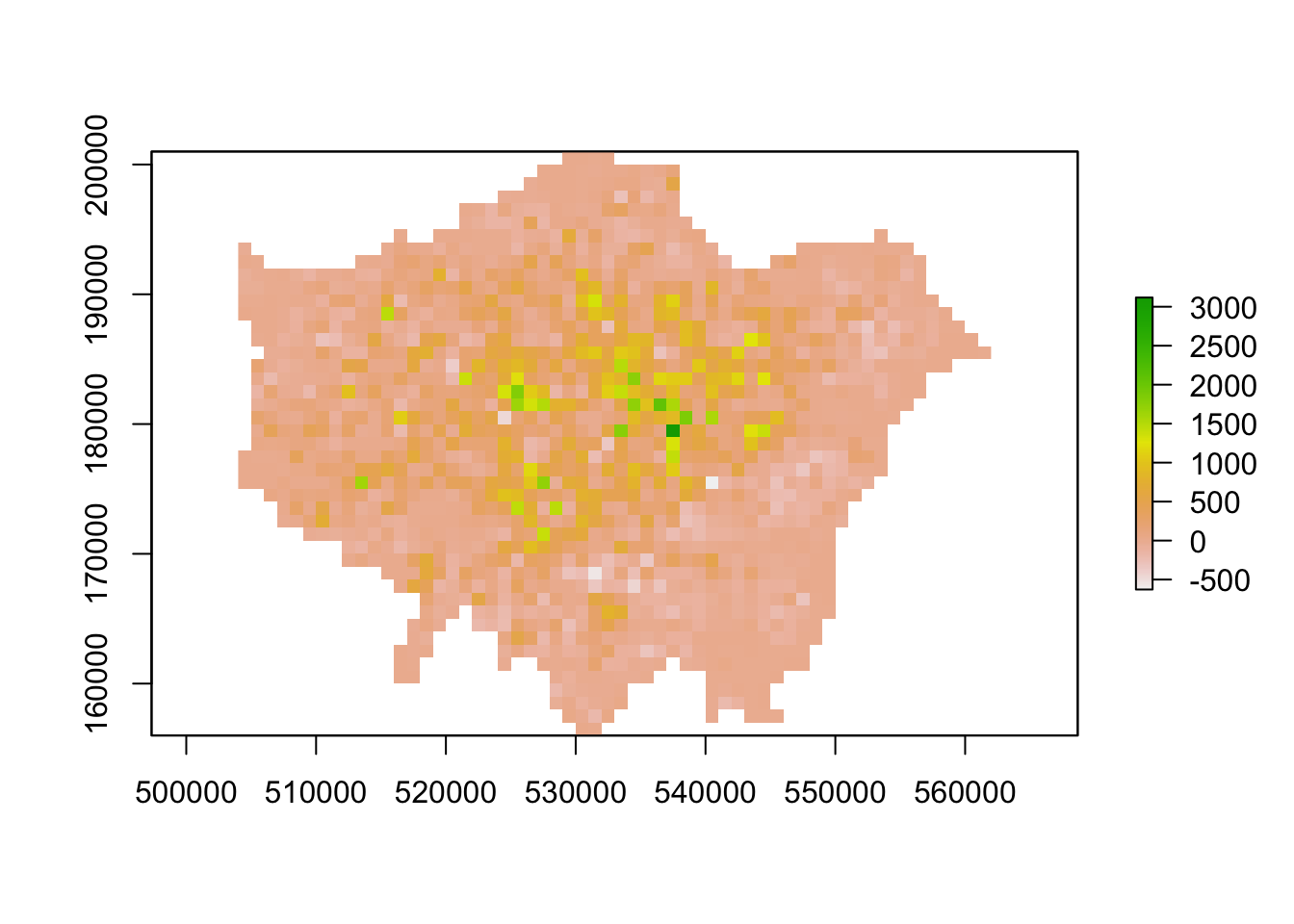
# example of focal statistics: mean of 9 neighbours
lon_smooth <- focal(lon_change,w=matrix(1,3,3),fun=mean)

# inspect
plot(lon_smooth)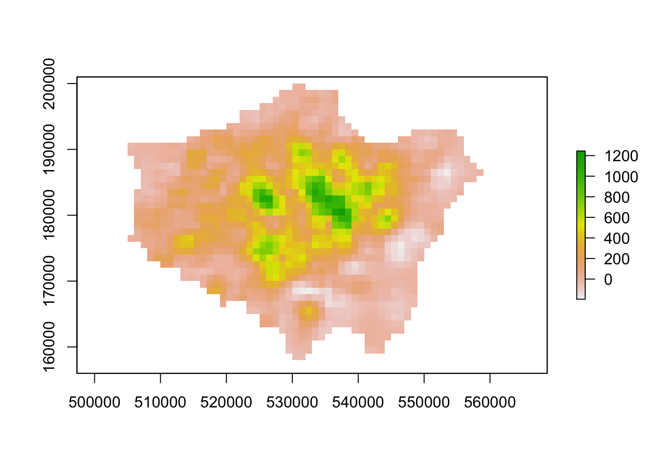
# example of zonal statistics: aggregate by raster cells
lon_agg1 <- aggregate(lon_change,fact=2, fun=mean)

# inspect
plot(lon_agg1)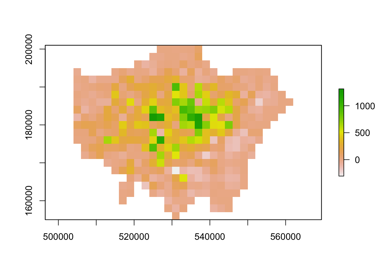
# example of zonal statistics: aggregate to administrative geography
# please note: the output is a vector that is forced to a SpatialPolygons object
lon_agg2 <- raster::extract(lon_change, lad, fun=mean, sp=TRUE)

# inspect
tm_shape(lon_agg2) +
  tm_polygons(col='layer')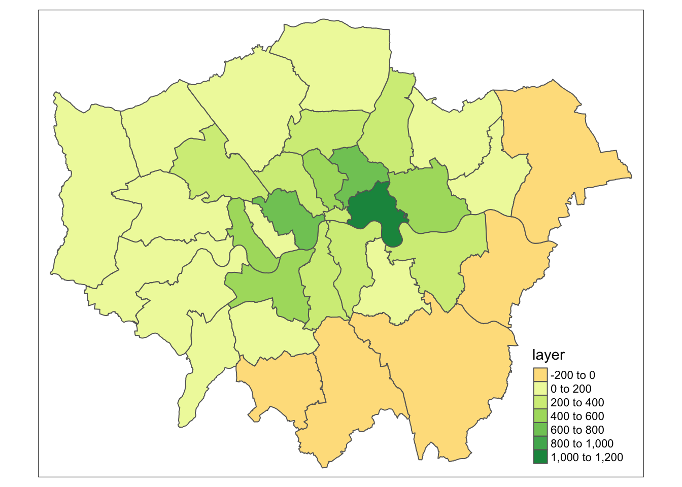
Note
Many packages share the same function names. This can be a problem when these packages are loaded in a same R session. For instance extract is not only the name of a function in the raster package, but also the name of functions in the magrittr and tidyr packages. To ensure you are using the function that you think you are using, you can specify the package: tidyr::extract or raster::extract.
7.2.3 Assignment
So far we have worked with raster data and made use of local, focal, and zonal statistics - but we have not yet looked at global statistics and functions. In this assignment you will work with global statistics and functions by executing a least-cost path analysis.
Below you will find a raster datasets containing (fake!) elevation data which will act as your cost surface. Your task is to calculate and map the least-cost path between a given start and end point using the elevation data as your cost surface.
Coordinates
- coordinates of the start point (XY): 515000, 160000
- coordinates of the end point (XY): 540000, 190000
No further instructions are provided and you will have to figure out on your own how to do this! We will discuss your choices and results in Friday’s seminar, so make sure to ‘bring’ your results along.
Tips
- Google is your friend.
- You are in charge of deciding what software you want to use.
- For the pupose of this assignment, you can use the elevation data directly as your cost surface.
- If you need to specify a coordinate system use the British National Grid.
File download
| File | Type | Link |
|---|---|---|
| Elevation cost surface | asc |
Download |
7.3 Interpolation and geostatistics
Now we know how to work with raster data, we can move on to point data interpolation and geostatistics. There are many reasons why we may wish to interpolate point data across a map. It could be because we are trying to predict a variable across space, including in areas where there are little to no data. We might also want to smooth the data across space so that we cannot interpret the results of individuals, but still identify the general trends from the data. This is particularly useful when the data corresponds to individual persons and disclosing their locations is unethical.
7.3.2 Example: Interpolation and geostatistics
Spatial interpolation is the prediction of a given phenomenon in unmeasured locations. For that, we need a set of procedures to calculate predicted values of the variable of interest, given calibration data. We will explore several methods by looking at air pollution in London by getting data from the Londonair website. Londonair is the website of the London Air Quality Network (LAQN), and shows air pollution in London and south east England that is provided by the Environmental Research Group of Imperial College London. The data are captured by hundreds of sensors at various continuous monitoring sites in London and the south east of England. The best of it all? The data are publicly available for download!
).](images/week07/07_london_air.png)
Figure 7.3: Continuous monitoring sites in London (Londonair 2020).
Questions
- Although we will use the air pollution data captured at the continuous monitoring sites in London, why may using air pollution not be the perfect type of data to use here?
We could manually download csv files from the Londonair website for all the monitoring sites we are interested in, however, there is also a R package that makes things much easier. Have a look at the documentation of the openair package so that you get an idea why we use the importMeta() and importKCL() functions below!
Note
Because openair contains C++ code, a compiler is needed. For Windows, for example, Rtools is needed. Depending on your system and configuration this can sometimes be a hassle. Fortunately, even though packed with functionality, we will only use openair to download all the air pollution data we are interested in: in case you cannot get openair to work on your computer you can download a copy of the dataset instead.
File download
| File | Type | Link |
|---|---|---|
| Air pollution London 2019 (NO2) | csv |
Download |
In what follows, we will be looking at Nitrogen Dioxide (NO2) in London for 2019. Let’s get started by importing our data using the functionality provided by openair or, alternatively, reading in the data you downloaded above.
# option 1: using openair package

# libraries
library(openair)
library(tidyverse)

# import all monitoring sites
sites <- importMeta(source='kcl',all=FALSE)

# import pollution data for 2019 for all monitoring sites // this will take a few minutes
pollution <- importKCL(site=c(sites$code),year=2019,pollutant='no2',meta=TRUE)

# you can ignore the 'XXX_2019 does not exist' messages:
# we just forcing a download for all possible sites
# irrespective of whether the monitoring site was active in 2019

# filter NA values for nitrogen dioxide
pollution <- filter(pollution,!is.na(no2))
# option 2: using downloaded csv file
# libraries
library(tidyverse)
# read in downloaded data // the file is quite large so we read directly from zip
pollution <- read_csv('raw/zip/no2_london_2019.zip')# inspect
head(pollution)## # A tibble: 6 x 7
## date no2 site code latitude longitude site_type
## <dttm> <dbl> <chr> <chr> <dbl> <dbl> <chr>
## 1 2019-07-01 12:00:00 14.5 Southwark - Towe… SK8 51.5 -0.0782 Roadside
## 2 2019-07-01 13:00:00 16.1 Southwark - Towe… SK8 51.5 -0.0782 Roadside
## 3 2019-07-01 14:00:00 16.2 Southwark - Towe… SK8 51.5 -0.0782 Roadside
## 4 2019-07-01 15:00:00 21.8 Southwark - Towe… SK8 51.5 -0.0782 Roadside
## 5 2019-07-01 16:00:00 19.7 Southwark - Towe… SK8 51.5 -0.0782 Roadside
## 6 2019-07-01 17:00:00 17.5 Southwark - Towe… SK8 51.5 -0.0782 RoadsideOof. That is quite a large data set. Let’s quickly make it more useable by aggregating the data and get the average NO2 value for each monitoring site. Let’s also make sure that we retain the latitude and longitude of our monitoring sites.
# aggregate data to unique latitude and longitude combinations, remove monitoring sites without coordinates
avg_pol <- pollution %>% group_by(latitude,longitude) %>%
                         summarise(no2=mean(no2)) %>%
                         filter(!is.na(latitude | longitude))

# inspect
avg_pol
## # A tibble: 192 x 3
## # Groups: latitude [192]
## latitude longitude no2
## <dbl> <dbl> <dbl>
## 1 49.8 -7.56 35.6
## 2 50.4 -4.14 17.5
## 3 50.7 -1.83 11.5
## 4 50.8 0.284 15.7
## 5 50.8 0.181 7.23
## 6 50.8 0.272 11.4
## 7 50.8 -0.782 27.8
## 8 50.8 -1.07 17.3
## 9 50.8 -0.277 25.8
## 10 50.8 -0.380 33.0
## # … with 182 more rowsSpatial interpolation models of point data can be roughly divided into two categories: deterministic models and geostatistical models. We will start by trying two deterministic models: Thiessen Polygons and Inverse Distance Weighting (IDW). Before we can continue, however, there is still a little bit of work to do to get our data right: we need to make sure that we only have monitoring sites in Greater London. We can do this in the same way as we did last week for our crime location data.
# load libraries
library(sf)

# load lad as sf
lad <- st_read('raw/boundaries/london_lad_2020/london_lad_2020.shp')
## Reading layer `london_lad_2020' from data source `/Users/Tycho/Dropbox/UCL/Web/jtvandijk.github.io/GEOG0114/raw/boundaries/london_lad_2020/london_lad_2020.shp' using driver `ESRI Shapefile'
## Simple feature collection with 33 features and 1 field
## geometry type: POLYGON
## dimension: XY
## bbox: xmin: 503568.2 ymin: 155850.8 xmax: 561957.5 ymax: 200933.9
## CRS: 27700# create point layer and project into british national grid (epsg 27700)
pol_points <- st_as_sf(avg_pol,coords=c('longitude','latitude'),crs=4326)[,1]
pol_points <- st_transform(pol_points,27700)
# ensure all points are within the boundaries of Greater London
lon_points <- st_intersects(lad, pol_points)
pol_points <- pol_points[unlist(lon_points),]
# inspect
tm_shape(lad) +
tm_fill() +
tm_shape(pol_points) +
tm_dots()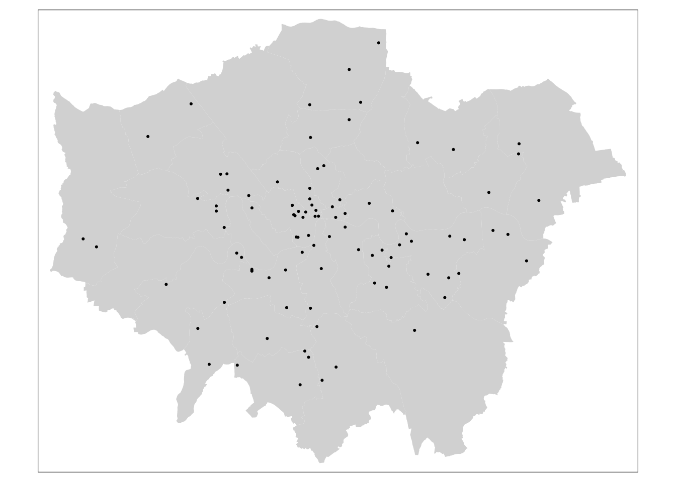
7.3.3 Thiessen Polygons
The first step we can take to interpolate the data across space is to create Thiessen polygons. Thiessen polygons are formed to assign boundaries of the areas closest to each unique point. Therefore, for every point in a dataset, it has a corresponding Thiessen polygon. The spatstat package provides the functionality to produce Thiessen polygons via its dirichlet tesselation of spatial point patterns function (dirichlet()). As we are using spatstat again, we also need to first convert the data to a ppp object. Let’s tesselate.
# load libraries
library(spatstat)
library(maptools)

# to sp
pol_points <- as(pol_points,'Spatial')
lad <- as(lad,'Spatial')

# update bounding box so that points on boundaries do not get excluded
pol_points@bbox <- lad@bbox

# let's tesselate
lon_th <- as(dirichlet(as.ppp(pol_points)), 'SpatialPolygons')

# set projection
proj4string(lon_th) <- CRS('+init=epsg:27700')
proj4string(pol_points) <- CRS('+init=epsg:27700')
## Warning in `proj4string<-`(`*tmp*`, value = new("CRS", projargs = "+init=epsg:27700 +proj=tmerc +lat_0=49 +lon_0=-2 +k=0.9996012717 +x_0=400000 +y_0=-100000 +datum=OSGB36 +units=m +no_defs +ellps=airy +towgs84=446.448,-125.157,542.060,0.1502,0.2470,0.8421,-20.4894")): A new CRS was assigned to an object with an existing CRS:
## +proj=tmerc +lat_0=49 +lon_0=-2 +k=0.9996012717 +x_0=400000 +y_0=-100000 +ellps=airy +towgs84=446.448,-125.157,542.06,0.15,0.247,0.842,-20.489 +units=m +no_defs
## without reprojecting.
## For reprojection, use function spTransform# the tesselation does not keep the attribute information from the point data
# so we will need to add this manually using a spatial join
lon_th.z <- over(lon_th, pol_points,fn=mean)
lon_th.spdf <- SpatialPolygonsDataFrame(lon_th, lon_th.z)
# clip to Greater London boundaries
lon_th.clp <- crop(lon_th.spdf,lad)
# inspect
tm_shape(lon_th.clp) +
tm_fill(col='no2')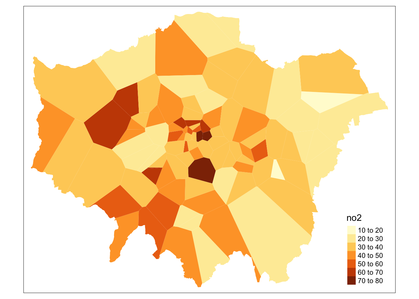
That’s it. Every borough in Greater London now got assigned the average value of Nitrogen Dioxide (in \(\mu\)g/m3) for 2019 provided by the closest monitoring site.
7.3.4 Inverse Distance Weighting
It has come to light that in some cases the below code does not work when you are running a more recent version of rgdal which migrated to using gdal 3 and proj 6. It looks like the gstat package has not yet accommodated this change. If you run into errors, just read through the assignments and results. In case you want to use IDW at some point in the future, other packages, such as the spatstat package, also offers IDW functionality!
A second deterministic method to interpolate point data is Inverse Distance Weighting (IDW). An IDW is a means of converting point data of numerical values into a continuous surface to visualise how the data may be distributed across space. The technique interpolates point data by using a weighted average of a variable from nearby points to predict the value of that variable for each location. The weighting of the points is determined by their inverse distances drawing on Tobler’s first law of geography that “everything is related to everything else, but near things are more related than distant thing”. The distance weighting is done by a power function: the larger the power coefficient, the stronger the weight of nearby point. The output is most commonly represented as a raster surface.
# load libraries
library(gstat)
library(xts)

# create empty raster grid over which to interpolate the pollution values
grid <-spsample(pol_points, type ='regular', n=100000)

# runs the idw for the no2 variable with a power value of 2
idw <- idw(pol_points$no2 ~ 1, pol_points, newdata= grid, idp=2)
## [inverse distance weighted interpolation]# specify spatial data as being gridded
gridded(idw) <- TRUE
# coerce to raster
raster_idw <- raster(idw)
# inspect
plot(raster_idw)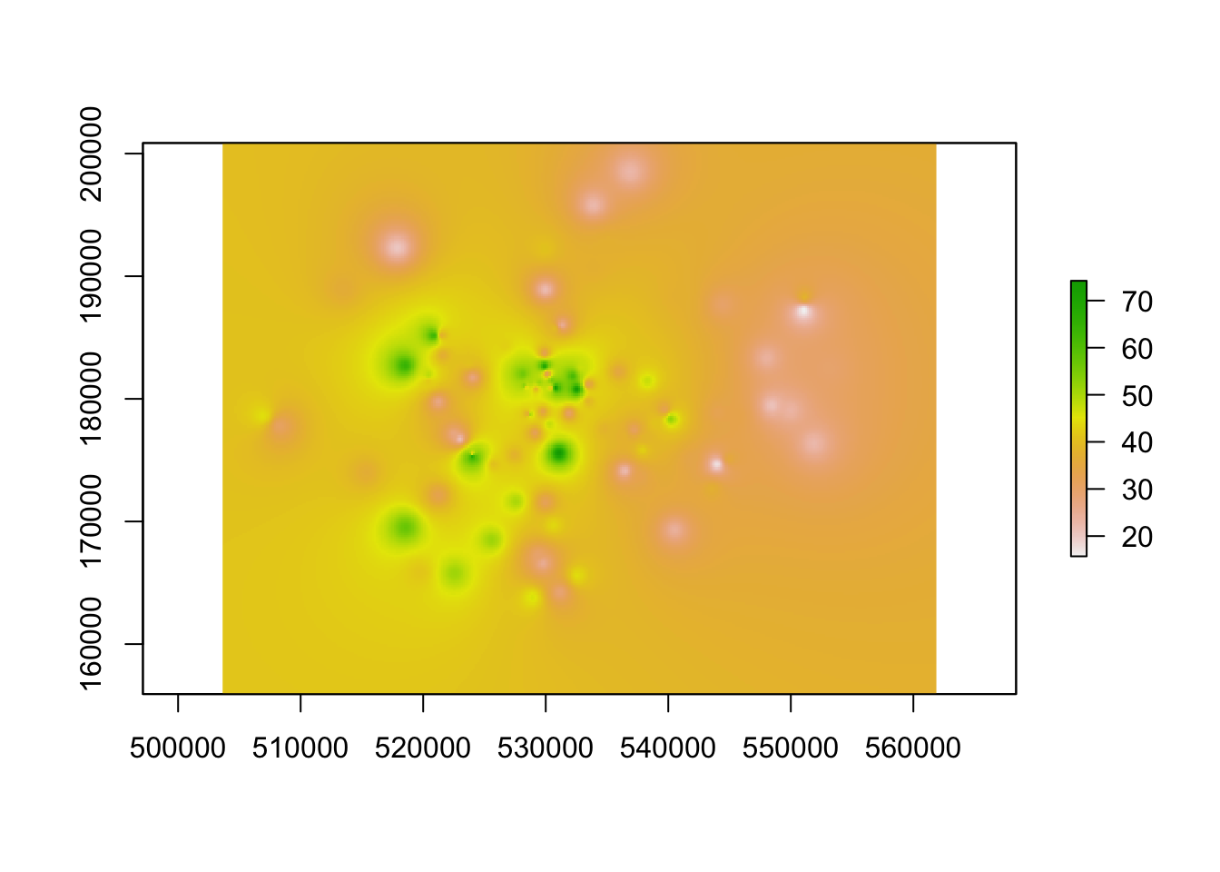
# plot prettyish
tm_shape(mask(raster_idw,lad)) +
  tm_raster('var1.pred', style='quantile', n=100, palette='Reds', legend.show=FALSE) +
  tm_shape(pol_points) +
  tm_dots() +
  tm_shape(lad) +
  tm_borders()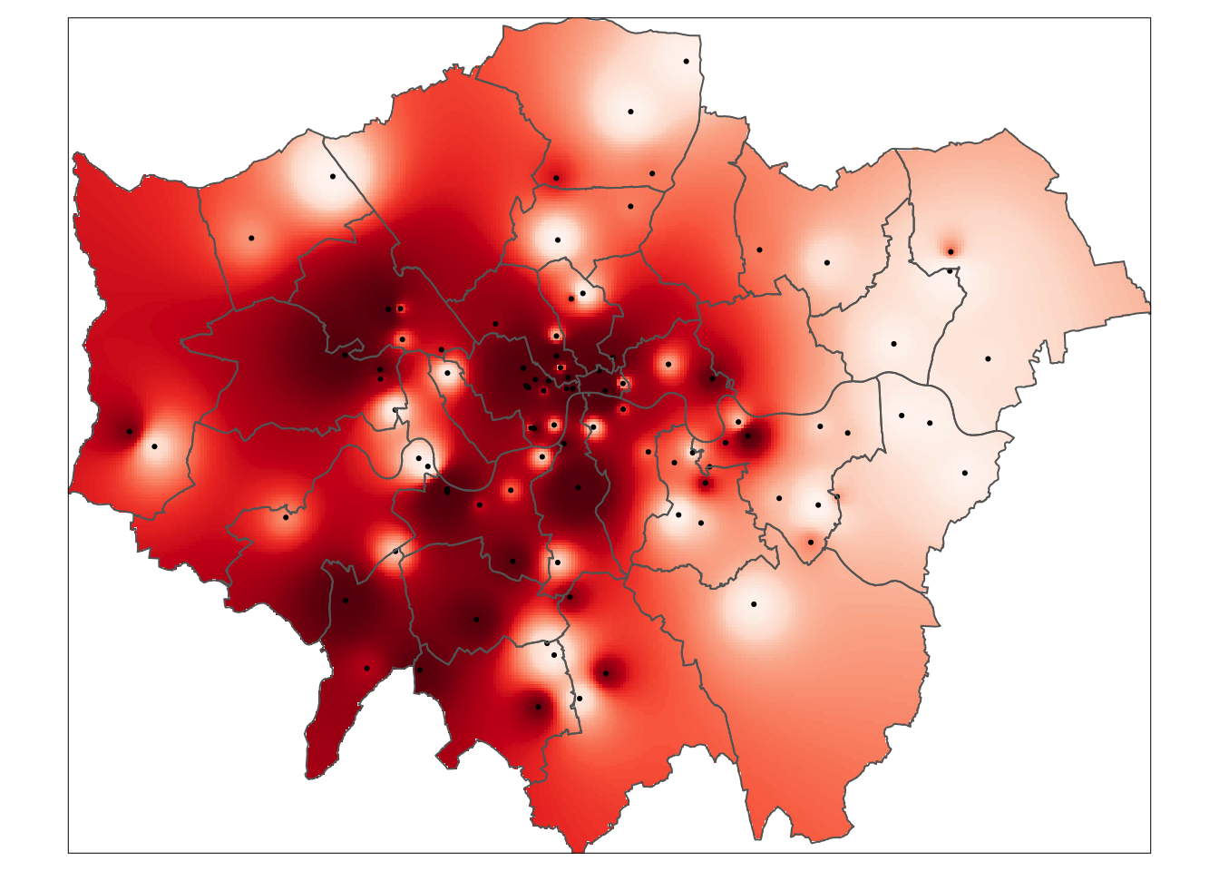
Questions
- Do you got any idea where the var1.pred variable in the
tm_raster()function is coming from that we use to plot the results of the IDW?
The main parameter in the IDW is the power function. How do you know whether you interpolation results are accurate? You can choose the power function based on literature, but you can also perform a leave one out cross validation (LOOCV). The idea is simple: you remove one data point from the dataset and then try to interpolate (predict) the value of this point using all other points in the dataset. Then you remove another data point from the dataset and then try to interpolate (predict) the value of this point using all other points in the dataset. And so on for all points in the dataset. You then can compare the interpolated point values with the actual values from the omitted points. The performance of the interpolation can be summarised using the root-mean-square error (RMSE) which you in effect try to minimise!
# create an empty vector of the same length as our pollution monitoring sites
idw.pred <- vector(length = length(pol_points))

# loop through all points every time leaving one of our pollution monitoring sites out
# assign the predicted result to the empty vector we created
for (i in 1:length(pol_points)) {
  idw.pred[i] <- idw(no2 ~ 1, pol_points[-i,], pol_points[i,], idp=2)$var1.pred
}
# inspect
idw.pred## [1] 45.29822 51.50944 49.37564 32.66893 36.90722 31.76426 27.84861 29.81761
## [9] 39.33103 44.79641 39.05047 55.17399 37.55353 49.04103 54.16264 42.28412
## [17] 49.98915 44.58587 40.07231 35.33835 38.26626 42.12244 46.30520 42.16079
## [25] 42.65499 37.37300 36.89304 37.34105 36.14922 31.98460
## [ reached getOption("max.print") -- omitted 66 entries ]# combine predicted values with observed values
idw.com <- as.data.frame(cbind('predicted'=idw.pred,'observed'=pol_points$no2))
# plot the predicted values against the observed values
# black line: if all points are on this line the predicted values are identical to the observed values
# blue line: shows the basic linear model of the scatter plot
ggplot(idw.com) +
geom_abline() +
geom_smooth(method='lm',aes(x=observed,y=predicted),se=FALSE) +
geom_point(aes(x=observed,y=predicted),colour=rgb(0,0,0,0.5)) +
xlim(c(0,80)) +
ylim(c(0,80))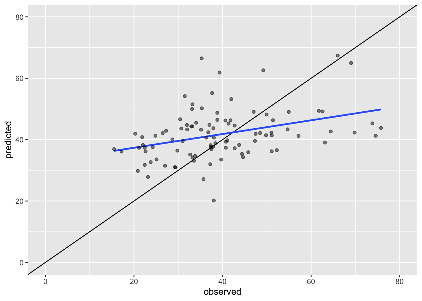
# calculate the RMSE
sqrt(sum((idw.pred - pol_points$no2)^2) / length(pol_points))
## [1] 13.05302Questions
- What happens to the RMSE when you repeat the LOOCV procedure by changing the power function to a value of 1.5?
- What happens to the RMSE when you repeat the LOOCV procedure by changing the power function to a value of 3?
- What happens when you re-do the IDW map but this time using a power function with a value of 15? Why does your map look like this?
- Do you think it is possible to reduce the RMSE value to 0 in this example? Why (not)?
7.3.5 Kriging
It has come to light that in some cases the below code does not work when you are running a more recent version of rgdal which migrated to using gdal 3 and proj 6. It looks like the gstat package has not yet accommodated this change. If you run into errors, just read through the assignments and results. In case you want to use kriging at some point in the future, other packages, such as the kriging package, also offers this functionality!
An IDW is not the only means of interpolating point data across space. A range of geostatistical techniques have also been devised. One of the most commonly used is kriging. Whilst an IDW is created by looking at just known values and their linear distances, a kriging also considers spatial autocorrelation. The approach is therefore more appropriate is there is a known spatial or directional bias in the data. Kriging is a statistical model which uses variograms to calculate the autocorrelation between points and distance. Like an IDW the the values across space are estimated from weighted averages formed by the nearest points and considers the influence of distance.
Note
There are various different ways of running a kriging, some are quite complex given that the method requires an experimental variogram of the data in order to run. If you want to know more, there is some excellent material available here but it is out of the scope of this course to go into much further detail.
# create a variogram
var.pol <- variogram(no2 ~ 1, pol_points, cloud=FALSE, width=1000)

# compute the variogram model
var.mod <- fit.variogram(var.pol, vgm(psill=100, model='Exp',nugget=160))

# inspect
plot(var.pol, var.mod)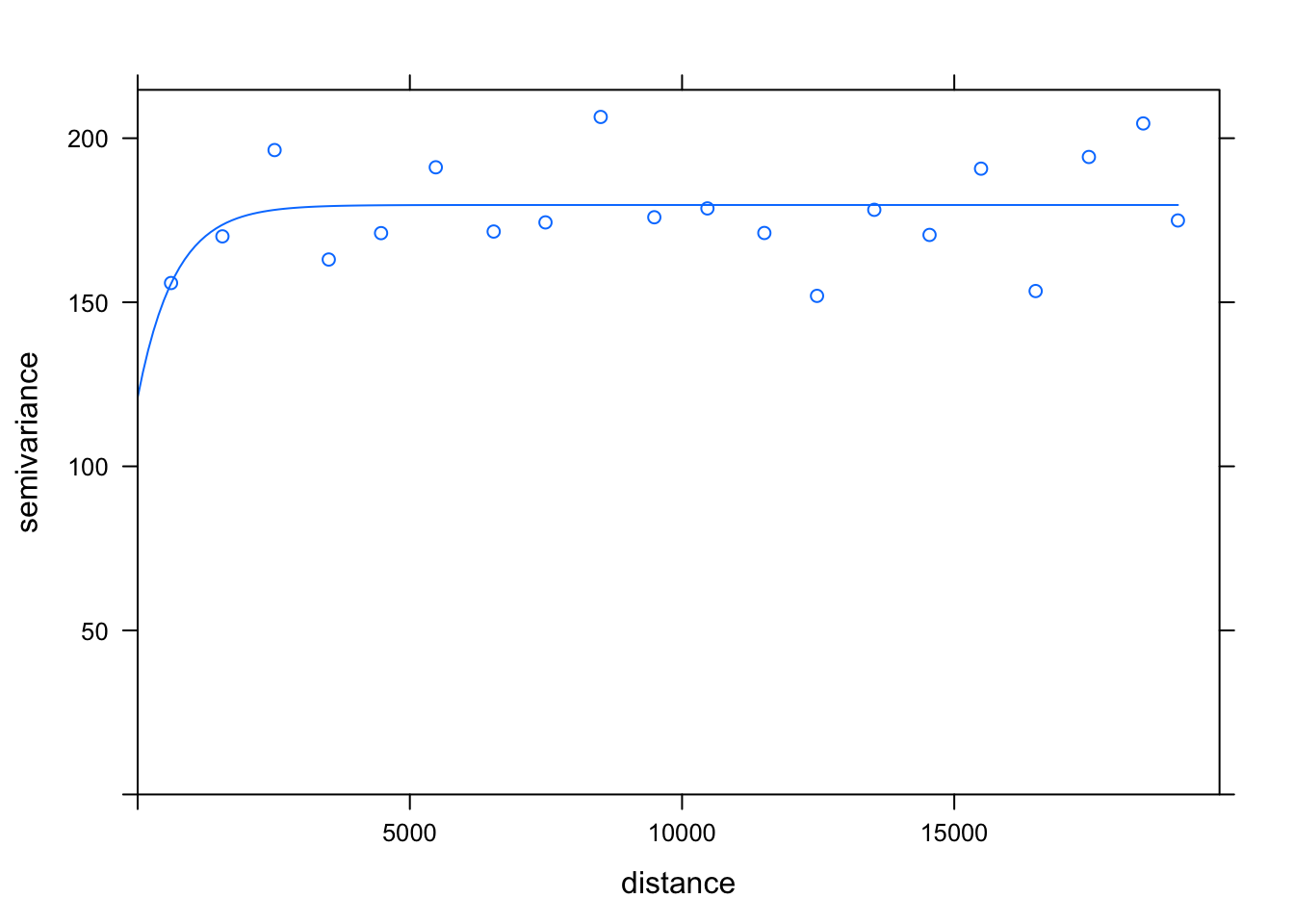
# create empty raster grid over which to interpolate the pollution values
grid <- as.data.frame(spsample(pol_points, type ='regular', n=100000))
names(grid) <- c('x','y')
coordinates(grid) <- c('x','y')
gridded(grid) <- TRUE
fullgrid(grid) <- TRUE
proj4string(grid) <- proj4string(pol_points)

# execute the kriging interpolation on a regular grid using the variogram as input
dat.krg <- krige(no2 ~ 1, pol_points, grid, var.mod)
## [using ordinary kriging]# convert to raster and mask
rst.krg <- raster(dat.krg)
# inspect
plot(rst.krg)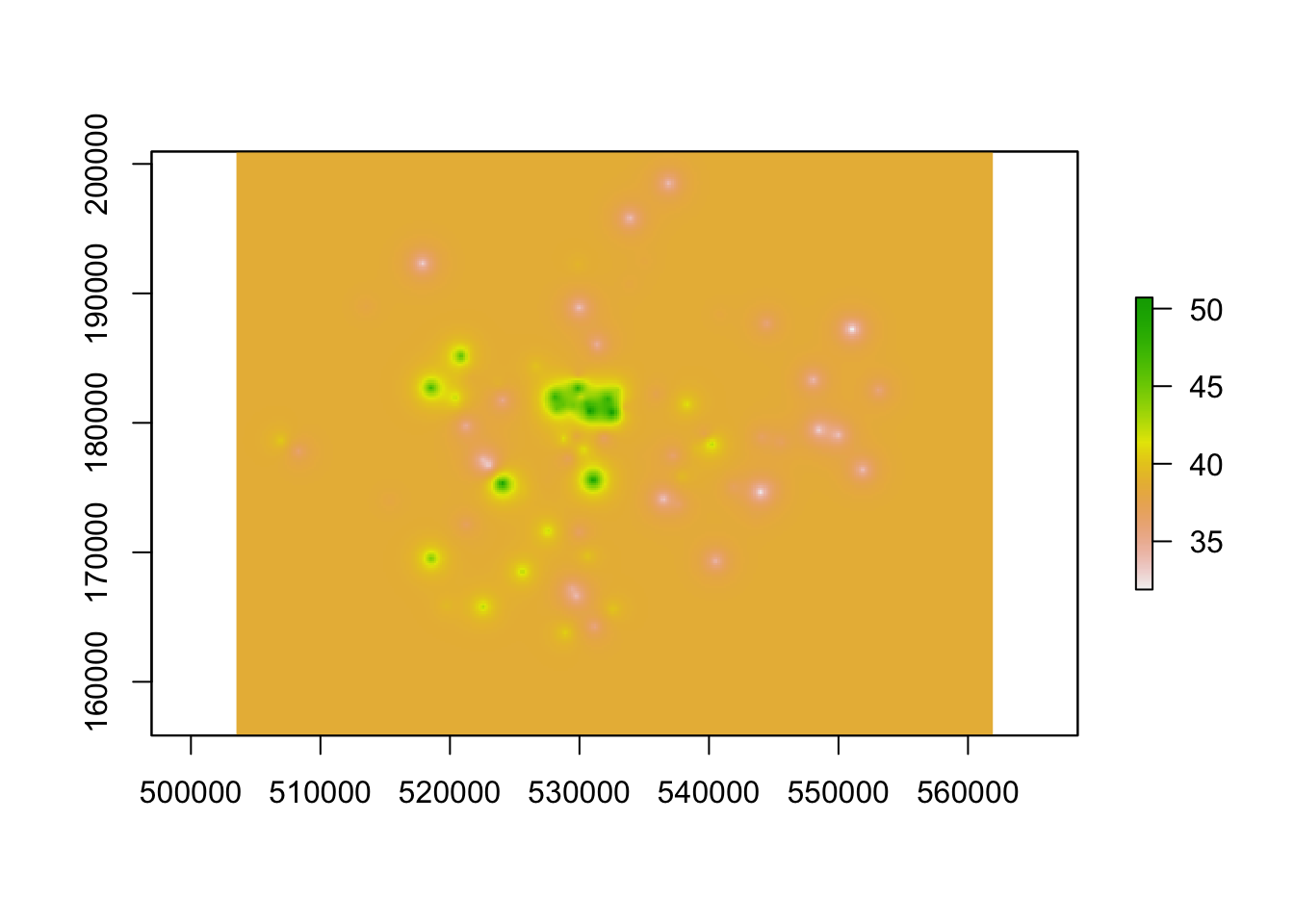
# plot prettyish
tm_shape(mask(rst.krg,lad)) +
  tm_raster('var1.pred', style='quantile', n=50, palette='Reds', legend.show=FALSE) +
  tm_shape(pol_points) +
  tm_dots() +
  tm_shape(lad) +
  tm_borders()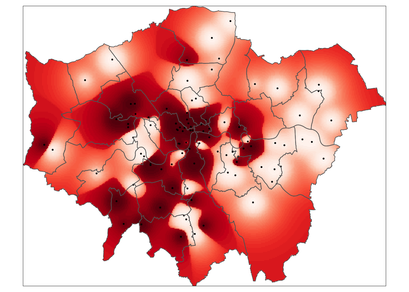
# create an empty vector of the same length as our pollution monitoring sites
krg.pred <- vector(length = length(pol_points))

# loop through all points every time leaving one of our pollution monitoring sites out
# assign the predicted result to the empty vector we created
for (i in 1:length(pol_points)) {
  krg.pred[i] <- krige(no2 ~ 1, pol_points[-i,], pol_points[i,], var.mod)$var1.pred
}
# inspect
krg.pred## [1] 40.24832 42.14059 42.06944 38.71840 38.76867 38.72003 38.10100 38.21305
## [9] 38.02985 39.31455 38.28428 41.70758 38.74461 43.84781 46.25688 39.03628
## [17] 41.00983 38.69278 38.78804 38.25703 38.33284 38.77227 40.04993 39.29443
## [25] 38.50121 38.50156 38.53598 38.75134 38.75178 38.20019
## [ reached getOption("max.print") -- omitted 66 entries ]# combine predicted values with observed values
krg.com <- as.data.frame(cbind('predicted'=krg.pred,'observed'=pol_points$no2))
# plot the predicted values against the observed values
# black line: if all points are on this line the predicted values are identical to the observed values
# blue line: shows the basic linear model of the scatter plot
ggplot(krg.com) +
geom_abline() +
geom_smooth(method='lm',aes(x=observed,y=predicted),se=FALSE) +
geom_point(aes(x=observed,y=predicted),colour=rgb(0,0,0,0.5)) +
xlim(c(0,80)) +
ylim(c(0,80))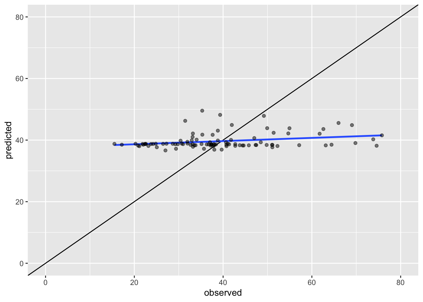
# calculate the RMSE
sqrt(sum((krg.pred - pol_points$no2)^2) / length(pol_points))
## [1] 12.91622Questions
- Which method gives a better performance: IDW or our quick attempt to kriging? Why do you say so?
That’s it. Using ordinary kriging we predicted the average value of Nitrogen Dioxide (in \(\mu\)g/m3) in 2019 for every location in Greater London.
7.4 Take home message
Although in many instances you will be working with vector data, especially where government statistics and administrative boundaries are involved, there are also plenty of use cases in which you will be working with raster data. You now know the basics of working with raster datasets as well as that you can create your own raster datasets by using interpolation and geostatistical methods such as kriging to predict a given phenomenon in unmeasured locations. That is it for this week!
7.5 Attributions
This week’s content and practical uses content and inspiration from:
- Gimond, M. 2020. Geodesic geometry. https://mgimond.github.io/Spatial/index.html
- Lansley, G., Cheshire, J. 2020. An Introduction to Spatial Data Analysis and Visualisation in R. https://data.cdrc.ac.uk/dataset/introduction-spatial-data-analysis-and-visualisation-r
7.6 Feedback
Please take a moment to give us some feedback on this week’s content.